Texture in Interior Design: How to Layer Stone, Wood, and Textiles So a Room Feels Finished
Colour is usually the first thing people think about when decorating a room, along with the layout and the furniture. But a room can have the right colours and the right sofa and still feel flat. What is missing is usually texture. Texture in interior design is the surface quality of everything in a room: the roughness of a stone wall, the weave of a rug, the grain of wood, the softness of linen. It is the element that gives a room depth, and this guide shows how three real homes use it, room by room, so you can use the same ideas without a renovation.
AUDIO SUMMARY: Texture in interior design is the surface quality that makes a room feel finished — stone, clay, rattan, linen, and wood layered together. This guide walks through three real homes that use texture brilliantly, from a stone-walled apartment in Switzerland to a clay-walled flat in Kyiv, then shows how to layer texture room by room without overdoing it in any home.
What Is Texture in Interior Design?
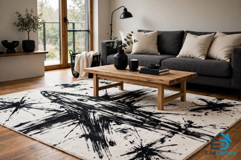
Texture in interior design describes how the surfaces in a room look and feel. There are two kinds, and both matter. Tactile texture is what you can feel: a rough stone wall, a nubby wool throw, a smooth marble countertop. Visual texture is what your eye reads as texture even though the surface is flat: the grain printed in wood-effect wallpaper, the shadow in a slatted panel, the pattern of a woven shade. A good room uses both, and it mixes them deliberately. A room with only smooth surfaces feels cold no matter how warm its colours are, so pair every smooth surface with something rough nearby.
The rule the source homes follow is simple: aim for at least three textures in any given view. One texture reads as an accident. Two reads as a contrast. Three reads as a design. The homes in this guide prove it. The first is an 86-square-metre apartment in Luzern, Switzerland, built around a stone feature wall. The second is a 50-square-metre apartment in Kyiv, Ukraine, designed by Sergey Makhno Architects around tactile clay walls. The third, designed and visualised by Igor Sirotov, is a dark, dramatic home of deep charcoal textured walls. Three homes, three palettes, one rule.
Home One: Stone, Marble, and Slatted Wood in Luzern
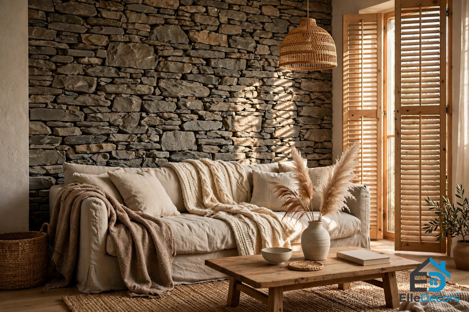
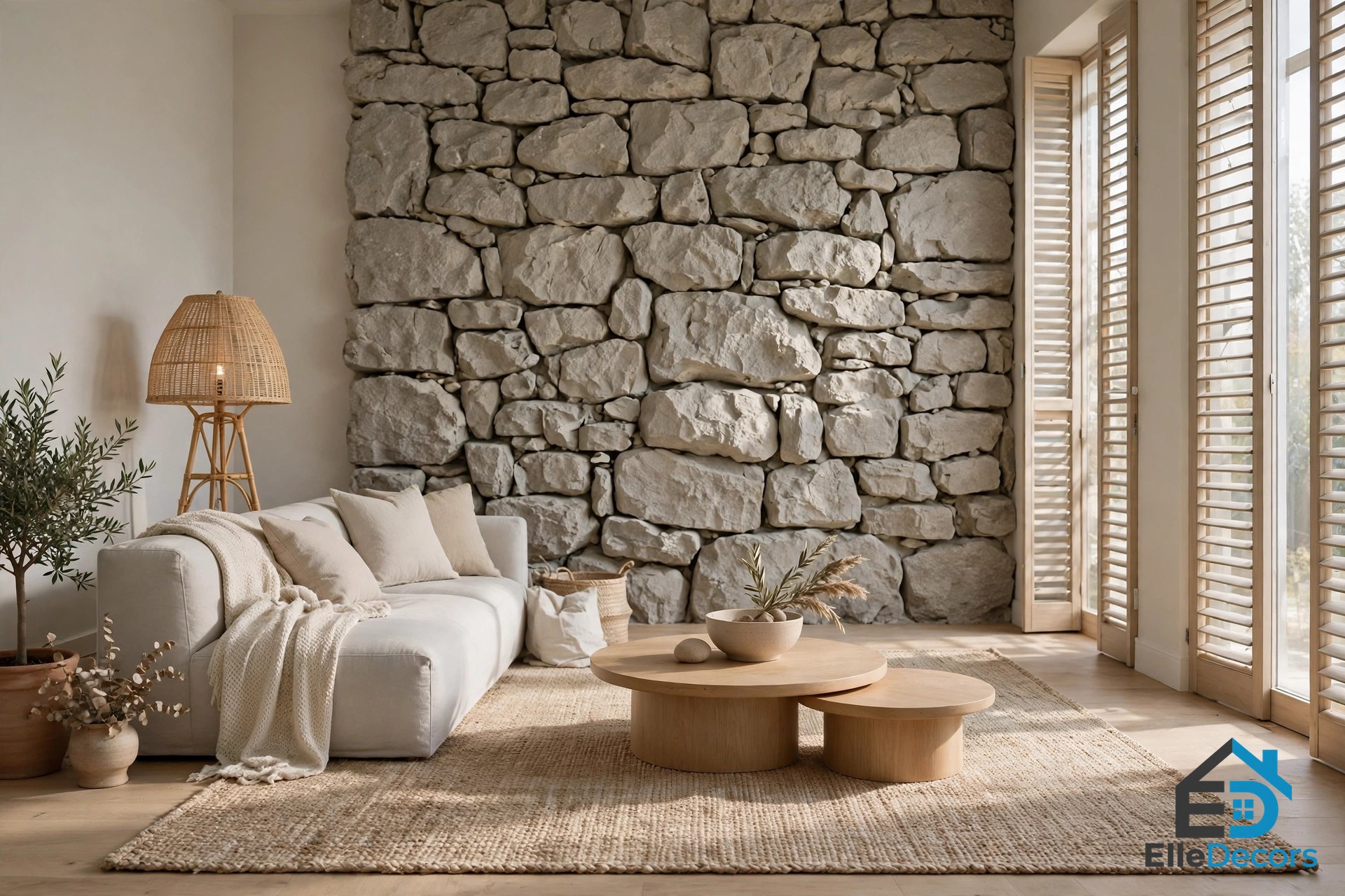
The Luzern apartment shows how to stop a very neutral and pale room from becoming boring: put a variety of textures to play. A stone feature wall stands proud in the living room, and the rest of the room is arranged as a set of contrasts around it. Slatted window shutters cross a large expanse of glass. Floor lamps carry rattan or crinkled paper shades. A durable natural woven rug sits against smooth round coffee tables, rough underfoot and smooth at hand height, in the same view.
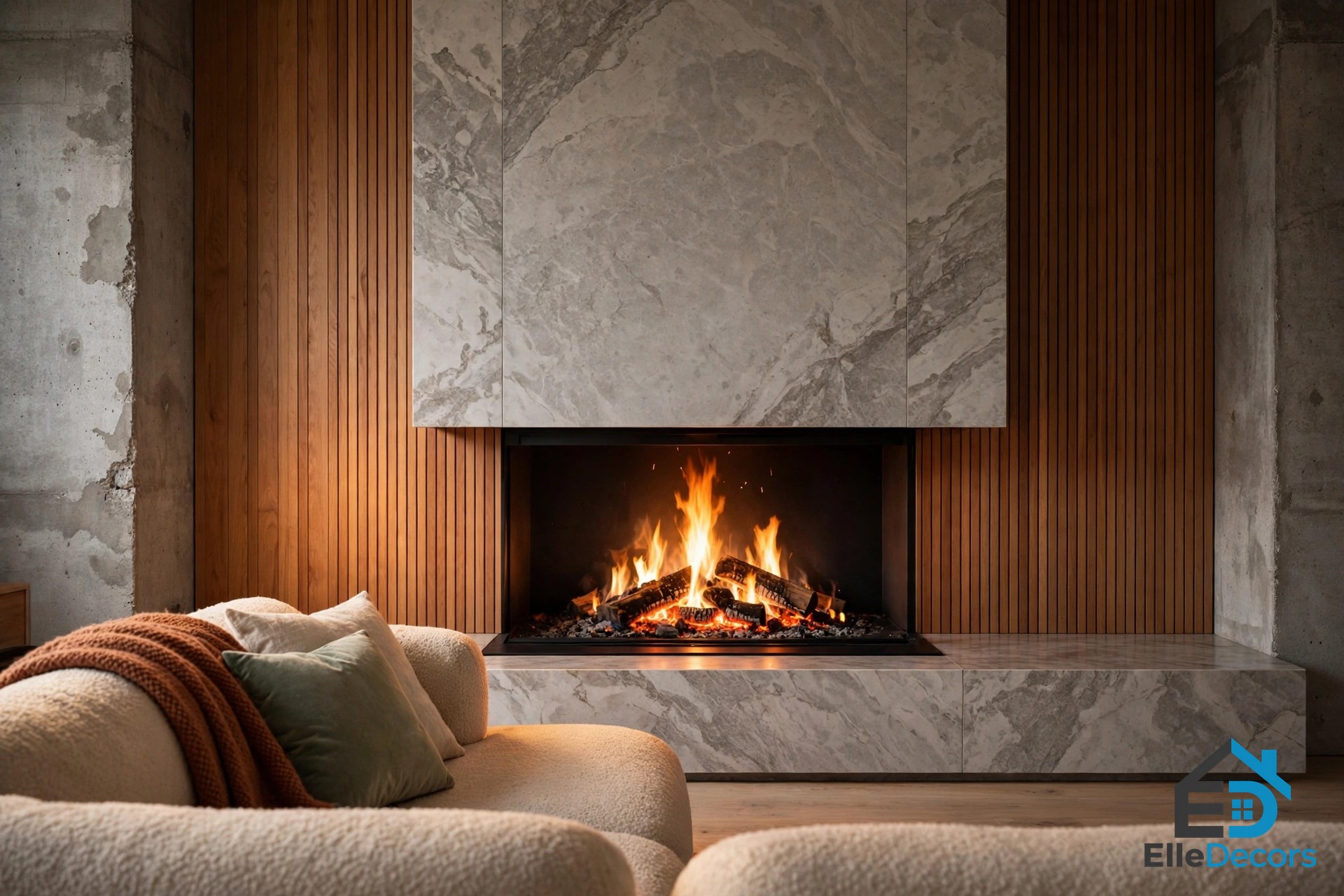
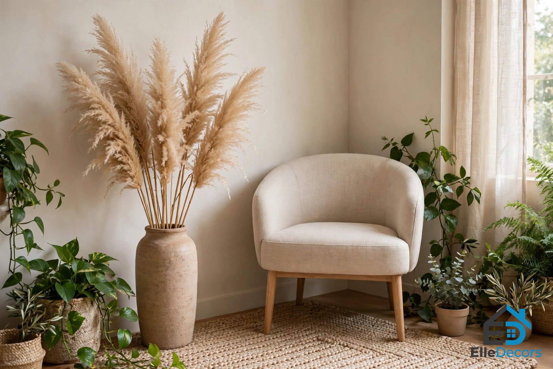
On the opposite side of the lounge, a modern fireplace burns in a wide marbled chimney breast. The cool marble is offset with a raw concrete background and warming wood panels, so the fire sits in a frame of three textures at once. Plants add texture too: green foliage feathers sharp edges, and dried specimens such as pampas grass bring softer colour, matching the natural tone of a modern accent chair in the corner of the room.
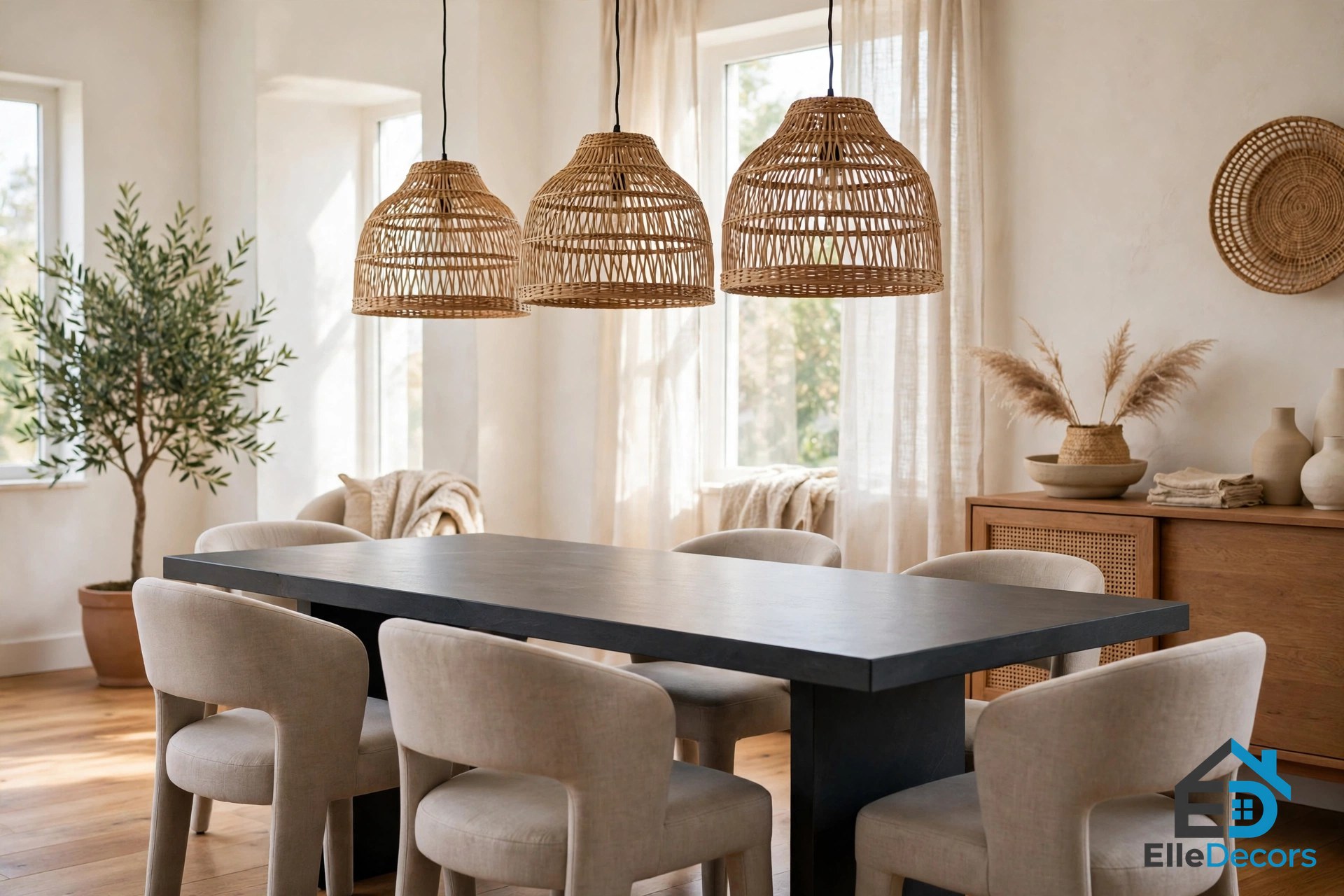
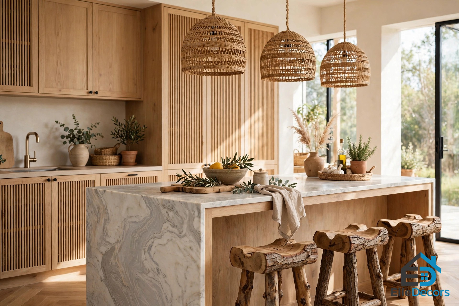
The dining area keeps the same language. Rattan dining room pendant lights provide light-permeable texture, teamed with a sleek modern table and soft upholstered chairs. The kitchen carries it further: the cabinets have slatted doors, giving them a slightly tribal look when teamed with hand-woven dining room light shades and a couple of tree log bar stools. The wooden kitchen bar stools push up to a marbled kitchen island, a meeting of two different natural grains. The other base units, the countertop, and the backsplash are marble-effect too, and a diagonal vein along the baseline offsets the rigid vertical nature of the slatted wall cupboards.
The Luzern home also teaches restraint, which is the other half of texture in interior design. At the end of the wood and marble galley kitchen run, a wall of white units camouflages with a white wall. By subduing some elements, the designers make a more eye-catching feature of another, in this case a wooden display cubby. The same set of textures translates into the bedroom, where the stone and wood slatted shutters from the living spaces reappear. Perimeter lighting exaggerates the accent wall with warm white LED strip lights, and a backlit vanity mirror dramatises a rustic bathroom wall. Light, in this home, is the tool that makes texture visible.
Home Two: Clay Walls and Wabi Sabi in Kyiv
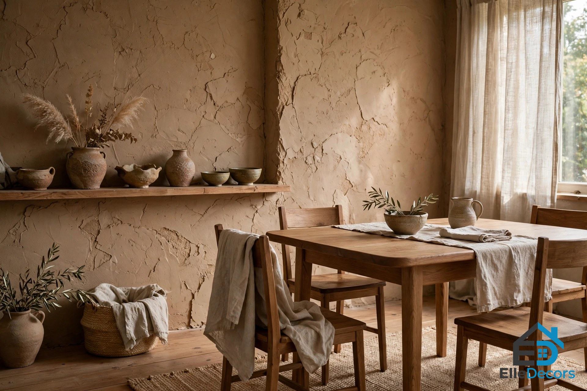
The Kyiv apartment is the most philosophical of the three. All of its walls are perfectly imperfect, finished with tactile clay. Architect Sergey Makhno explained the thinking: “We appreciate the Wabi Sabi philosophy and saw imperfect things as beauty. This apartment shows natural irregularity and calmness, love for natural materials and shapes.” Wabi Sabi is the Japanese idea that imperfection and age are beautiful, and here it is built into the walls themselves.
Rough walls require smooth contrast, and the apartment supplies it: a smooth wood dining set stands against the clay, and rough, rustic wooden kitchen cabinets are juxtaposed with sleek hi-tech appliances such as the integrated oven. The owner travels frequently to Thailand and Sri Lanka, where mixing modernity with tradition is commonplace, and the interior reflects that. Wood, clay, and linen create an all-natural living space, and areas of texture are complemented with original handmade items for even more character.
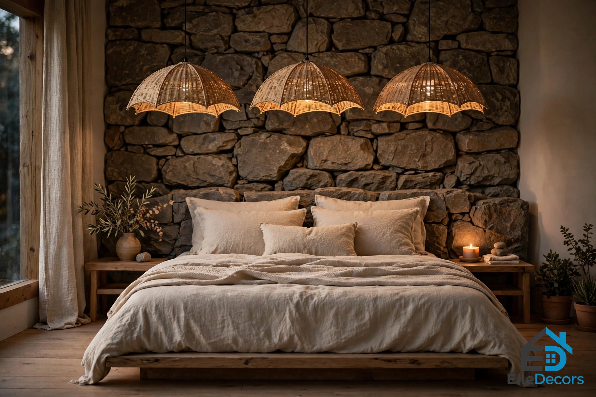
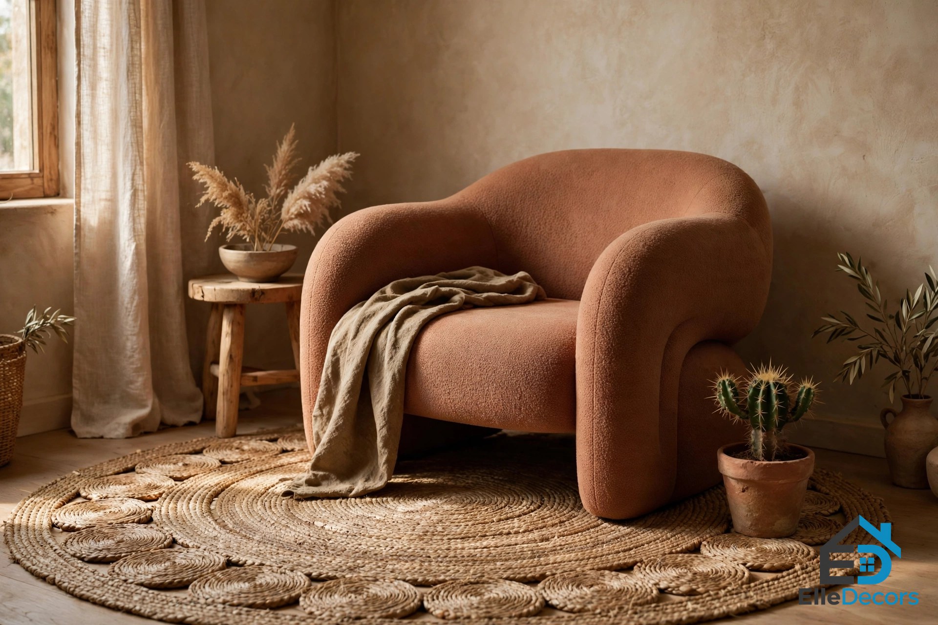
The bedroom carries the idea in lighting. A unique trio of umbrella-shaped bedroom pendant lights provides mood lighting, their rustic nature at home against a stone headboard wall. Patinated pieces evolve in texture over time, like the pendant light on the opposite side of the platform bed, which gains character as its surface ages. Texture groupings appear throughout: a natural rug makes rough woven rings around a curvaceous accent chair, and a cactus makes a spiky addition to the same view.
The bathroom was positioned in the old balcony space and elevated onto a podium, and it continues the material story: clay-effect bathroom pieces provide a refreshing change from basic acrylic, and tactile cloud-like light shades float above the tub. The lesson of this home is that texture in interior design does not need to be loud. Clay, linen, and wood are all quiet materials, and the room feels rich because they are layered, not because any one of them shouts.
Home Three: Charcoal Walls and Gold Light
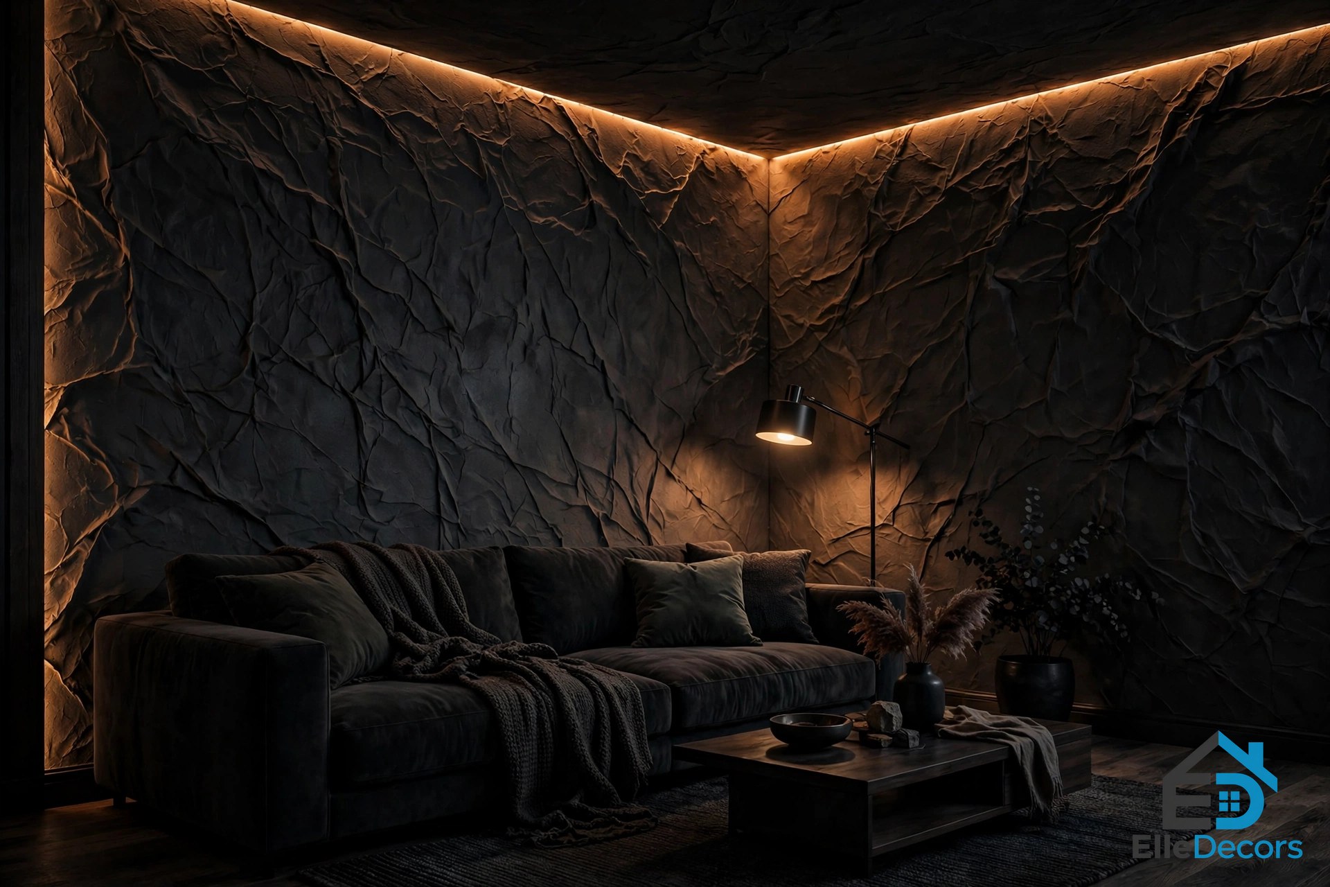
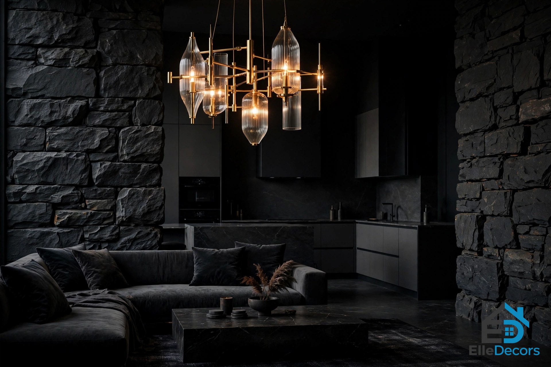
The third home is the boldest of the three, and it shows what happens when texture is turned all the way up. Deep textured walls run through the home, and perimeter lights highlight creased walls of deep charcoal. A modern floor lamp brightens a shady corner by a cosy sofa, and the kitchen cabinets carry a textured effect too, completing the look. An upholstered sofa creates a visual cushion between the hard lounge walls and the kitchen, soft furniture doing the job that a rug does in a paler room.
Where room textures are hard and stony, the designers bring in luxe elements such as a gold and glass modern chandelier. The black and grey kitchen almost disappears into the dark backdrop; it is the change in texture that defines it, not the change in colour. That is a useful test for any room: if you photographed it in black and white, would you still see the design? In this home, the answer is yes, because the textures carry the scheme.
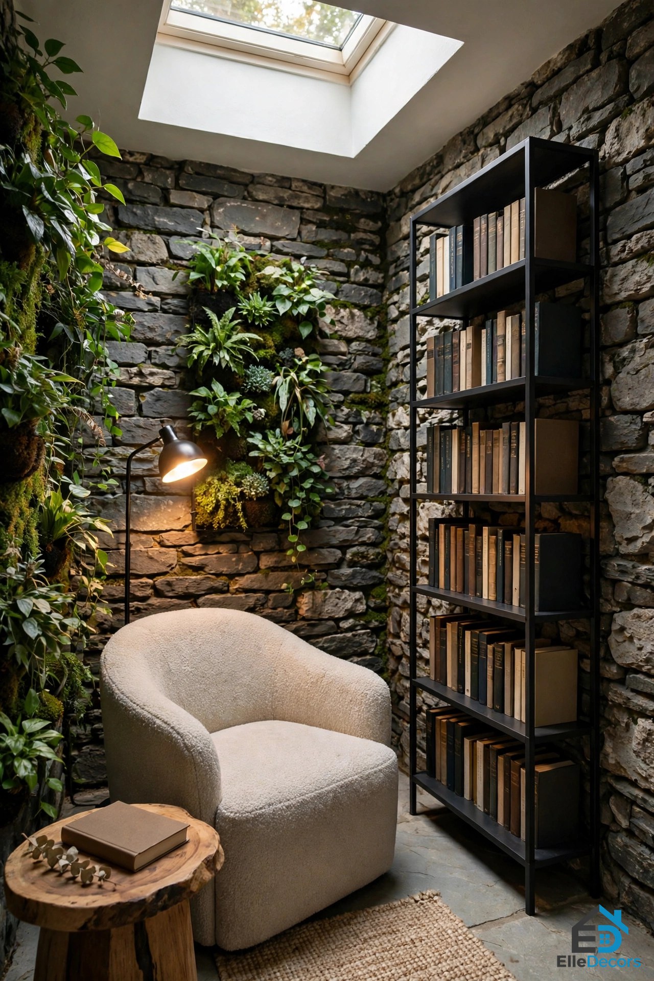
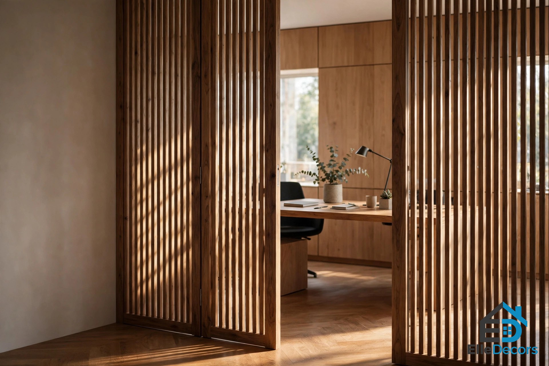
Contrast floor treatments define different areas, and light does the rest. A floor lamp casts a spotlight on a small area, while a skylight throws generous light that is ideal for nurturing a leafy vertical garden. A reading nook nestles in one stony corner, made up of a sleek bookcase, a comfortable reading chair, and a small side table. The texture is reined back on the bedroom headboard feature wall, a deliberate quiet spot in a loud home. Wooden panels smoothly back a workspace, a modern wall sconce is directed at a sleek desk with wine glasses and a mesh desk chair, and slatted doors divide space while still allowing light through.
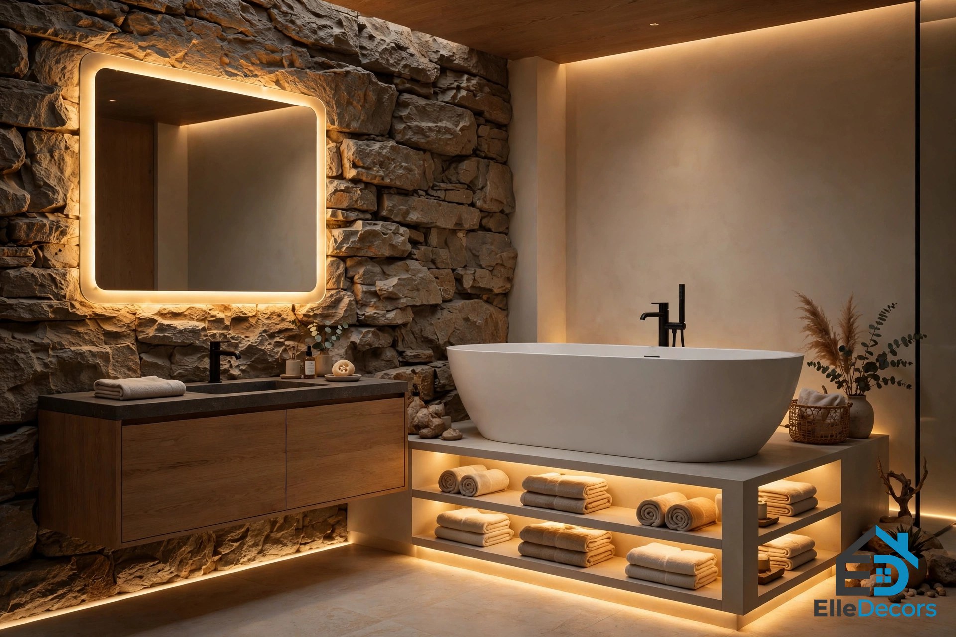
The bathroom shows the same layered lighting as the Luzern home: a modern lighting scheme provides a layered look, LEDs illuminate shelves beneath a beautiful bathtub, and an illuminated mirror greatly exaggerates a wall treatment. The mesh bedroom pendant lights in the suite are the Random light by Moooi, and the glow accentuates the warm tone of the wooden panels. Dark rooms need this kind of lighting more than pale ones do, because texture disappears in shadow unless light is aimed at it.
How to Layer Texture Room by Room
Start with the largest surfaces, because they set the texture budget for everything else. A room with a stone wall can take soft linen and smooth marble; a room with plain painted walls needs more help from rugs, curtains, and woven shades. Walls come first: a stone feature wall, a clay or limewash finish, a slatted panel, or textured wallpaper such as grasscloth, which is made of woven plant fibres on a paper backing. Floors come second: a natural woven rug over wood, or contrasting floor treatments to define different areas, as the third home does. Then add furniture texture: an upholstered sofa against hard walls, a wood dining set against clay, a leather chair against linen cushions.
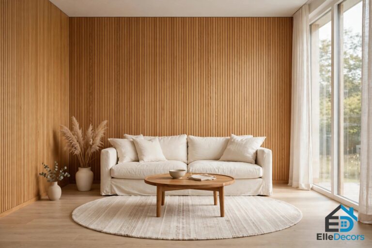
Textiles are the easiest layer to change, and the most forgiving. Throws, cushions, curtains, and rugs can be swapped without tools, which makes them the right place to experiment. Mix fabric weights: a plush throw over a smooth cotton duvet, velvet cushions beside linen, a wool rug under a rattan chair. Keep the colours in one family while the textures vary, so the room reads as layered rather than busy. If you want a deeper guide to the colour side of this, our warm color interior guide covers palettes that pair well with heavy texture, and our black and white interior guide shows how texture carries a room when colour is removed almost entirely.
Then add the small textures: plants, handmade objects, woven baskets, patinated metal. Texture in interior design is also the cheapest way to make a rental feel personal, since none of these layers needs permission or tools. The Kyiv home’s rule is worth copying: complement areas of texture with original handmade items, because a handmade object carries a texture no factory finish can copy. Finally, aim the light. Perimeter LED strips, a backlit mirror, a floor lamp in a dark corner, or a skylight over a vertical garden will all make texture visible. Without directed light, even the best materials look flat after sunset.
Know when to turn the texture up and when to rein it back. The Luzern home subdues a whole wall of white units so the wooden cubby beside it stands out. The third home reins texture back on the bedroom headboard wall so the room can rest. If every surface shouts, nothing is heard. Pick one feature per view, a stone wall, a clay finish, a slatted panel, a chandelier, and let the rest of the room support it quietly. Our ideas for interior decorating guide covers the same room-by-room thinking for the whole home, if you want to plan texture alongside colour and layout.
Texture by Material
This table sums up texture in interior design by material, so you can pick the textures that fit your room and your budget.
| Material | What it adds | Best placement | Watch out for |
|---|---|---|---|
| Stone | Rough, cool, permanent | Feature walls, fireplaces | Needs soft contrast nearby |
| Clay and limewash | Soft, imperfect, matte | Whole-room walls, bathrooms | Shows marks; seal in wet areas |
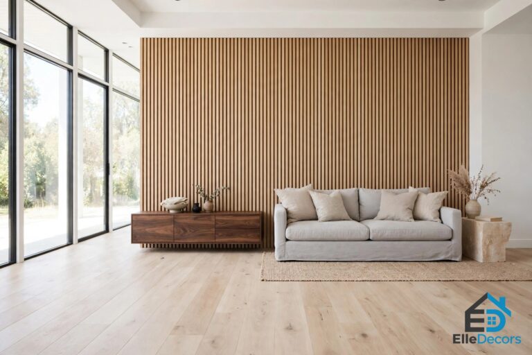
| Wood, slatted | Warm, linear, natural grain | Shutters, cabinets, headboards | Can darken a small room |
| Rattan and wicker | Light, woven, airy | Pendant shades, baskets, chairs | Keep dry; dust collects in weave |
| Linen and wool | Soft, warm, touchable | Curtains, throws, rugs, cushions | Linen creases; wool needs care |
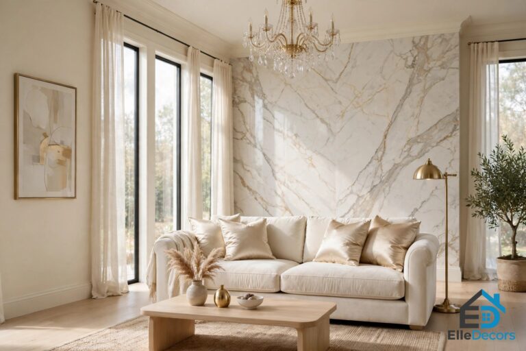
| Marble | Smooth, cool, veined | Islands, countertops, baths | Vein direction matters visually |
| Glass and mirror | Reflective, light-moving | Backlit mirrors, slatted doors | Shows fingerprints; aim light well |
| Plants | Living, soft, irregular | Corners, shelves, vertical gardens | Match light and water needs |
Frequently Asked Questions
What is texture in interior design?
Texture in interior design is the surface quality of the materials in a room, perceived through touch and through sight. Tactile texture is what you can feel, such as a rough stone wall or a soft wool throw, while visual texture is what your eye reads as texture, such as the grain in wood or the shadow in a slatted panel. A room needs both, mixed deliberately.
How many textures should a room have?
Aim for at least three textures in any given view, which is the rule the homes in this guide follow. One texture reads as an accident, two as a contrast, and three as a design. Add more only if the colours stay in one family; if every surface is a different colour and a different texture, the room turns busy.
How do I add texture without renovating?
Start with the finishing layer, which needs no tools: throws, cushions, a woven rug, linen curtains, baskets, and plants. Then change the lighting, since directed light is what makes texture visible. A feature wall, slatted panels, or textured wallpaper comes last, once you know which textures you actually live with.
Can a dark room have texture?
Yes, and dark rooms often show texture better than pale ones, because the change in texture defines the space when colour cannot. The charcoal-walled home in this guide proves it: the black and grey kitchen is defined by its surfaces, not its colours. The condition is light: aim perimeter lighting, a floor lamp, or a backlit mirror at the textured surfaces, or they disappear in shadow.
The Bottom Line
Texture in interior design is what turns a decorated room into a finished one. The three homes in this guide show the range: a pale Luzern apartment where stone, marble, and slatted wood keep a neutral room interesting; a Kyiv flat where clay walls and linen follow the Wabi Sabi idea that imperfect things are beautiful; and a dark charcoal home where texture carries the whole scheme and gold light does the talking. The rules travel with you: at least three textures in every view, one feature per view, soft against hard, and light aimed at the surfaces you want people to notice. Start with textiles, add one feature wall, and let the room tell you what it needs next.