Black and White Interior: Room-by-Room Ideas for a Timeless Monochrome Home
A black and white interior is the easiest palette to admire and one of the easiest to get wrong. On a screen it looks crisp and expensive. In a real room, the wrong black goes flat, the wrong white goes blue and clinical, and an even split can read like a checkerboard instead of a designed space. The rooms that work follow a few clear rules about ratio, undertone, and texture.
The ideas below come from six minimal black-and-white homes featured by Home Designing, plus current room-by-room guides. One quick clarification first: “black and white designs” online often means graphic design and logos. That is a different subject — this guide is about rooms only.
The Rules That Make a Black and White Interior Work
Pick a dominant color, not a 50-50 split
The first rule of a black and white interior is that it is never a 50-50 split. Equal black and white feels like a referee shirt. The rooms that work use a ratio: roughly 70 percent of one color, 20 percent of the other, and 10 percent of a softening accent such as wood, brass, or a muted gray-green.
White-dominant rooms feel airy and suit living rooms and small spaces. Black-dominant rooms feel intimate and suit studies, powder rooms, and dining rooms used mostly at night. A near-even split works only in kitchens and baths, where counters and tile lines naturally divide the two colors. Decide your dominant color before you buy paint. A pure two-color room is the one that consistently reads cold.
Match the undertones
Black and white both carry undertones, and mismatched undertones sink more monochrome rooms than any wrong shade. A blue-black wall next to a cream-white trim looks like two different projects collided. Keep both colors in the same family: warm black plus warm white reads cozy and grounded, while cool black plus cool white reads sharp and modern.
The pairings below come from published manufacturer color data; the “black” in most good schemes is a soft off-black or charcoal, and reflectance values are approximate. Warm: Iron Ore (Sherwin-Williams 7069, about 6) with Alabaster (7008), and Soot (Benjamin Moore 2129-20, about 8) with White Dove (OC-17). Cool: Tricorn Black (Sherwin-Williams 6258, about 3) with Pure White (7005), Black Magic (6991, about 4) with Extra White (7006), and Onyx (Benjamin Moore 2133-10, about 4) with Chantilly Lace (OC-65). Budget neutral: Cracked Pepper (Behr PPU18-01, about 5) with Polar Bear (75).
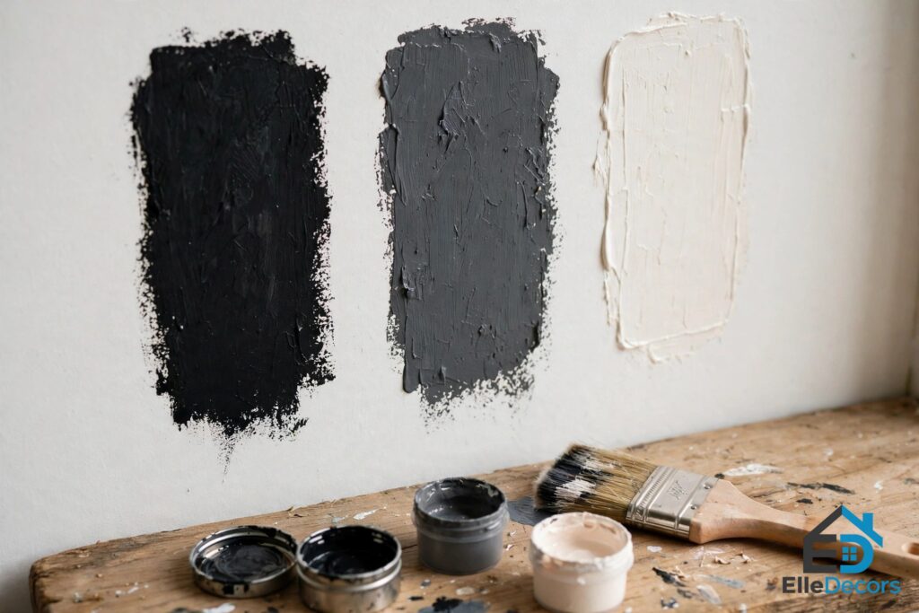
Test before you commit: paint a large swatch of your black next to your white on the actual wall and check it in morning, afternoon, and evening light. Covering a wrong black takes primer and several coats.
Always add a third quiet tone
The third tone is not optional. Wood, brass, or a warm gray does the softening two colors alone cannot. Oak floors, walnut furniture, a single wood beam, brass hardware, or a brushed-gold lamp all inject warmth that chrome and nickel cannot. In the six featured homes, the warmest rooms let wood do this job: dark wood floors under layered textiles in a bedroom, and light wooden floors warming a bright 75-square-meter apartment. If your room feels cold, the answer is almost never more white. It is usually wood, texture, or warm metal.
The Living Room: Go White-Dominant
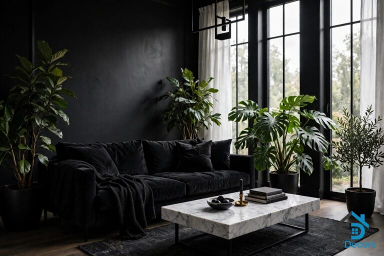
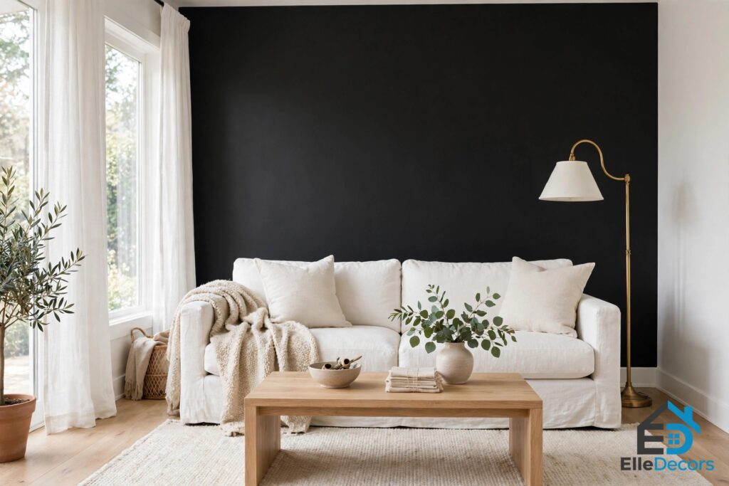
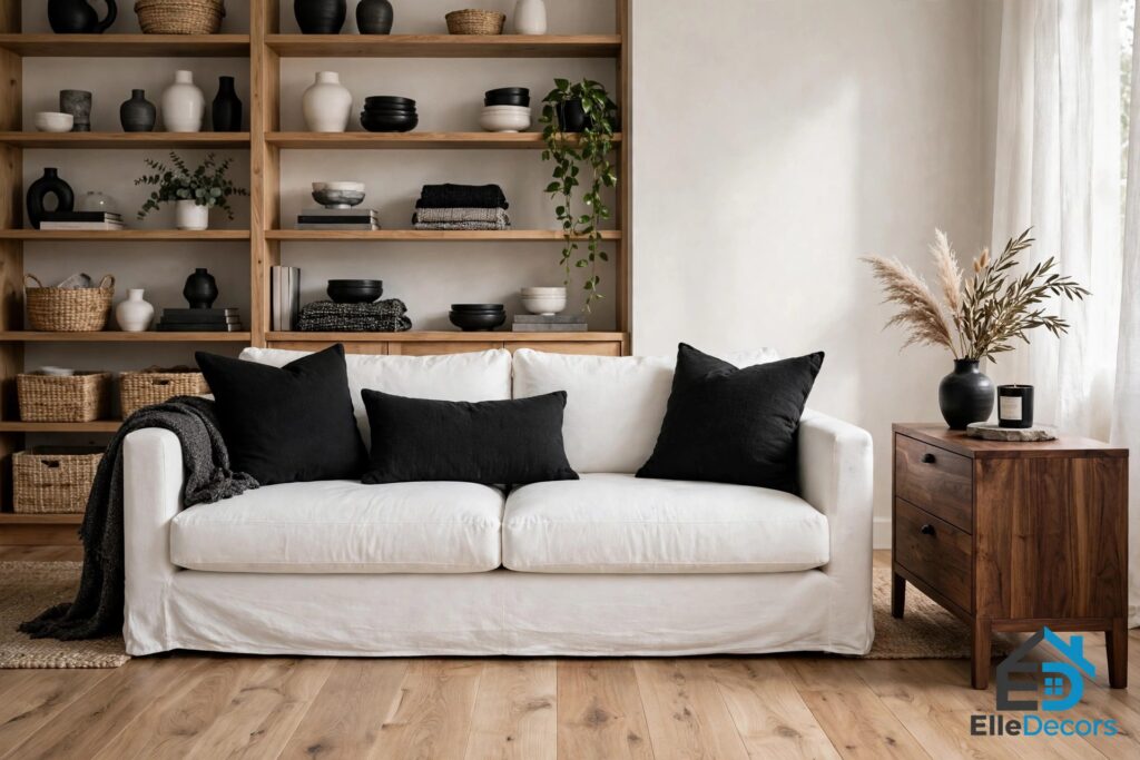
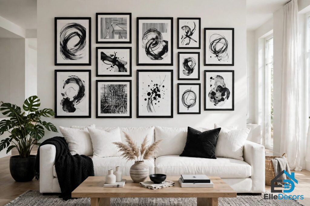
A black and white interior shows its quality first in the living room, because this is where most people overdo the contrast. Go white-dominant: warm white on the big walls, and let black show up in deliberate doses — a fireplace surround, window frames, a single bookcase. That keeps the room bright and lets black read as intentional punctuation.
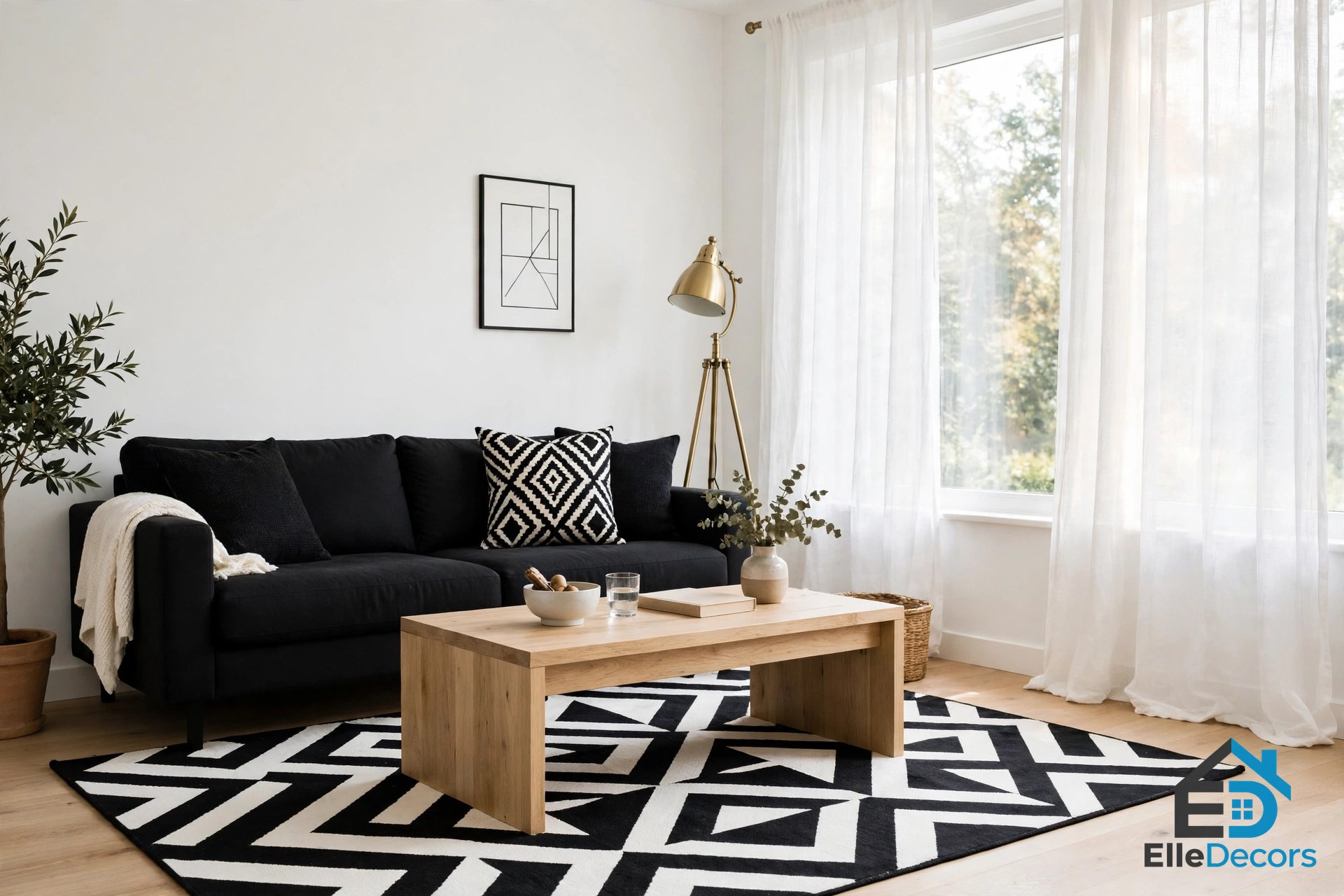
If you want one bold gesture, paint a single wall in a soft black like Iron Ore behind the sofa. Add the third element: a wood coffee table, oak floors, or brass lighting. Mix textures so the room does not feel flat — a soft white rug with a sleek black leather sofa, a stone coffee table, linen curtains, a wool throw — and add pattern in small doses, such as striped cushions or a bold monochrome rug.
The Kitchen: Let the Architecture Divide the Colors
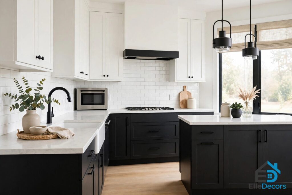
The kitchen is the one room where a black and white interior can run closer to even, because the architecture does the dividing for you. The classic move is white uppers and black or charcoal lowers: Tricorn Black or Black Magic on the base cabinets, a clean white on the uppers and walls, and a white or marble-look counter to bridge them. The eye reads the horizontal band of counter as breathing space, so the contrast never feels harsh.
A black island in an otherwise white kitchen is the lower-commitment version. Pick the finish carefully: black cabinets show every fingerprint in a high-gloss sheen, so a satin or matte eggshell is far more forgiving day to day. In the Home Designing homes, standout kitchens pair black cabinetry with geometric chairs, or use a distressed concrete backsplash to add another touch of gray. White countertops against black cabinetry read luxurious, particularly with a white subway tile backsplash.
The Bedroom: Soft Blacks and Layered Texture
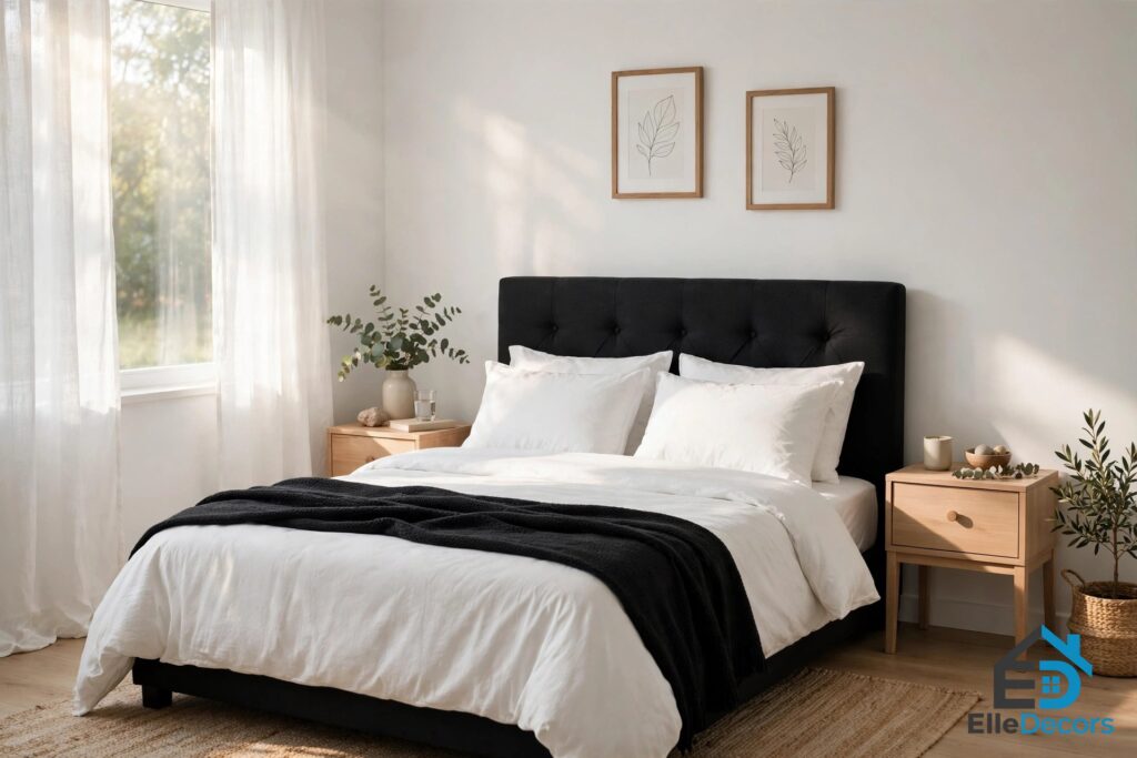
A black and white interior in the bedroom should lean soft, because this is the room where the palette has to help you sleep. Skip true black on the walls; it can feel cave-like over a full night. Try a warm charcoal like Soot or Iron Ore behind the headboard, with White Dove everywhere else. The result is moody and restful rather than stark.
Layer in texture: a linen headboard, a chunky knit throw, wood nightstands, crisp white bedding with a black throw. In one featured home, the bedroom feels warm despite minimal decoration because of dark wood floors and layered textiles, with brown blown-glass bedside lamps bringing out the warm tones of the rugged floors. In another, the bedroom parallels the living room: high texture on the furniture, pristine white walls, and a black-and-white photograph of a natural scene instead of a headboard. For a calmer version of this palette, look at japanese decor — its low furniture and natural materials share the same discipline as a monochrome bedroom.
The Bathroom: Small Rooms Take Big Contrast
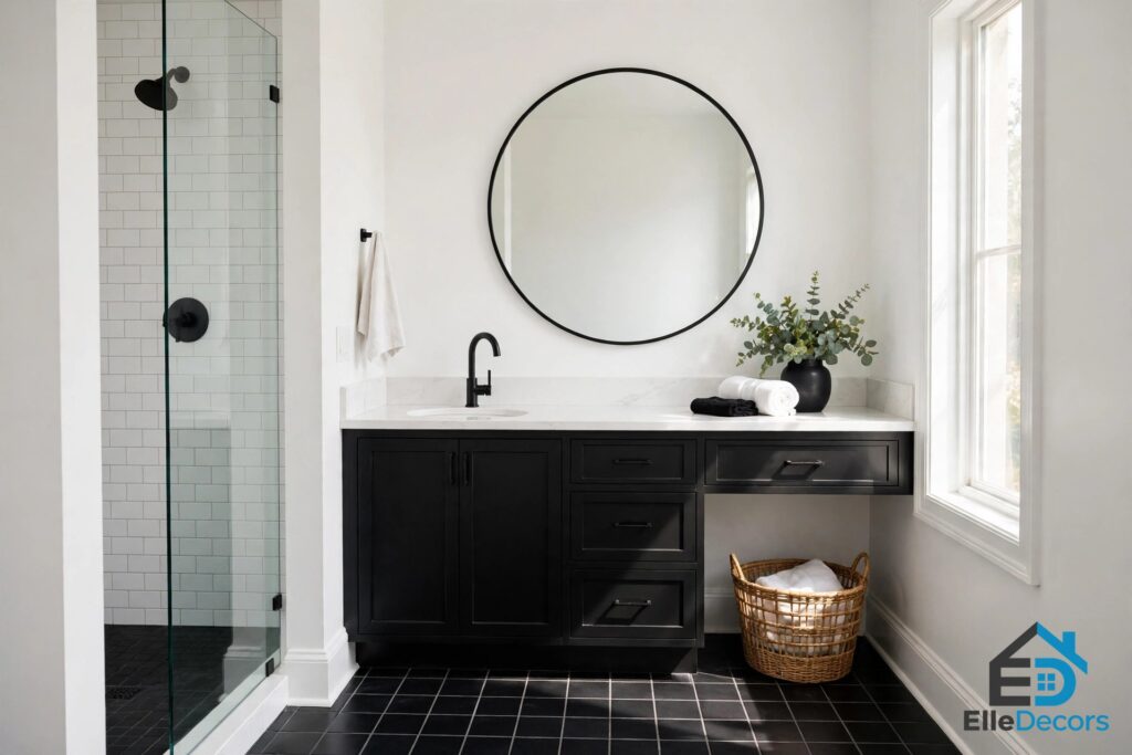
Bathrooms are small, so high contrast lands cleanly here, and the classic black-and-white tile look never dates. For a small bath, keep the walls white — a cooler white like Chantilly Lace works well here, since tile and chrome read crisp — and let black show up in the floor tile, the vanity, or the hardware. A black vanity under a white counter with black faucets is a low-risk combination that reads custom.
In a powder room, flip it: paint the whole space a soft black like Iron Ore with white trim and a big mirror. Small dark rooms feel like a jewel box, not a cave. The Home Designing tour ends with bathrooms that follow this logic: sophisticated dark interiors, golden indirect lighting, and a carved surface inside the bathtub as the single sculptural detail. Keep fixtures simple — small details like faucets carry real weight here.
Dining Rooms and Hallways: Drama and Flow
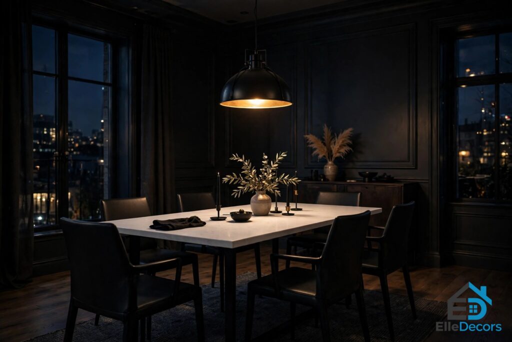
The dining room is the natural home of a black-dominant scheme, because it is mostly used at night. A white dining table with black chairs makes a strong statement, while a black chandelier overhead adds drama. Keep the lighting warm and low: a soft pendant light makes the room intimate. In the featured homes, dining areas use vertically striped chairs and wire-framed table legs to echo patterns elsewhere in the room.
Hallways are often overlooked, but white walls and a black runner rug guide the eye from one room to another. Black-framed photographs or mirrors turn a simple passage into a gallery-like experience. In the source homes, hallways carry the theme with low-profile benches, matte black storage cabinets, and black lines that carry the eye along the path.
Materials and Finishes: Matte Versus Gloss
Finish is where a monochrome room succeeds or fails, because black and white have no color to hide behind. Matte and gloss do opposite jobs, and the rooms that feel expensive mix them on purpose. Matte black absorbs light and reads soft, calm, and modern. Gloss black reflects light and reads sharp and dramatic. The same split applies to white: matte walls feel warm and quiet, while glossy tile feels crisp and clean.
Texture matters even more than sheen: marble counters, matte black fixtures, glossy tile, and soft linen curtains create tactile variety. In the source homes, texture does the work color cannot — striped chairs, wire frames, distressed concrete, carved stone, and brick painted in grays with black mortar. When a room feels flat, the fix is rarely another color — usually a new texture against a smooth surface.
Wood is the most reliable warming material in this palette, and the best use of wood in modern designs guide shows how far one warm material can carry a cool scheme — on floors, a table, open shelving, or a single beam.
Lighting and Pattern: The Finishing Layers
Lighting matters more in a monochrome home than in a colorful one, because light is what moves across the black-and-white surfaces all day. Large windows, skylights, or sheer curtains flood a room with daylight; in the source homes, floor-to-ceiling windows let the view and the daylight carry rooms that are otherwise almost entirely gray, black, and white.
In the evenings, warm artificial lighting softens the contrast. Hang pendants low enough to feel intimate and high enough that nobody bumps them. Avoid cool, blue-white bulbs in a warm scheme: they push whites toward clinical and blacks toward flat.
Patterns thrive here because the absence of other colors lets them shine. Stripes, chevrons, checks, and geometric motifs all take on new life in black and white. A bold striped rug can elongate a hallway; herringbone tiles create movement in a bathroom. Scale is the skill: mix one large-scale pattern with one small-scale pattern and keep the rest plain. For more pattern ideas, the ideas for interior decorating guide covers layering pattern, texture, and color without losing control of a room.
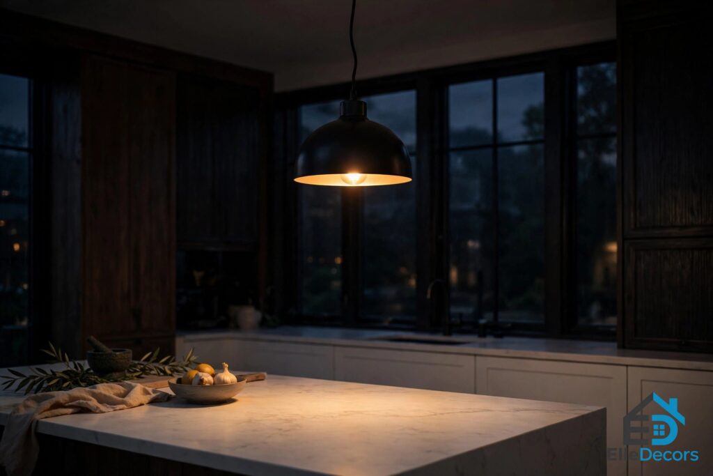
Balance by Room at a Glance
Use this black and white interior balance guide to set the split for each room before you choose paint or furniture. The ratios are starting points — shift them warmer with wood and texture, or cooler with chrome and gloss.
| Room | Suggested split | Dominant color | Best black placement | Warming element |
|---|---|---|---|---|
| Living room | 70 white / 20 black / 10 accent | White | Accent wall, frames | Wood table, brass lamp |
| Kitchen | 50 white / 40 black / 10 accent | Split | Lower cabinets, island | Wood stools, marble counter |
| Bedroom | 70 white / 20 black / 10 accent | White | Headboard wall, furniture | Linen, knit throw, wood |
| Bathroom | 60 white / 30 black / 10 accent | White | Floor tile, vanity | Warm lighting, plant |
| Dining room | 60 black / 30 white / 10 accent | Black | Chairs, chandelier | Warm pendant, wood table |
| Hallway | 70 white / 20 black / 10 accent | White | Runner rug, frames | Wood bench, mirror |
Common Mistakes to Avoid
An even 50-50 split in a living room. Save the balanced split for kitchens and baths. Everywhere else, pick a dominant color and commit to it.
Mismatched undertones. A blue-black against a cream-white makes the room feel subtly off. Keep warm with warm and cool with cool, and test swatches together on the wall before you paint.
No third tone. A room with only black and white reads cold and unfinished. Wood, brass, or a quiet accent color is not decoration — it is part of the scheme.
Too much gloss black. High-gloss black shows every fingerprint and smudge. Use gloss in small doses and keep large surfaces matte or satin.
Forgetting texture. Without color, texture keeps a room from feeling flat. If the room looks like a photograph rather than a place, add linen, wool, leather, rattan, or rough wood.
Ignoring the light. Black walls in a dark room with cool bulbs feel like a cave. Check swatches in morning, afternoon, and evening light.
Watch: A Modern Black and White Apartment Tour
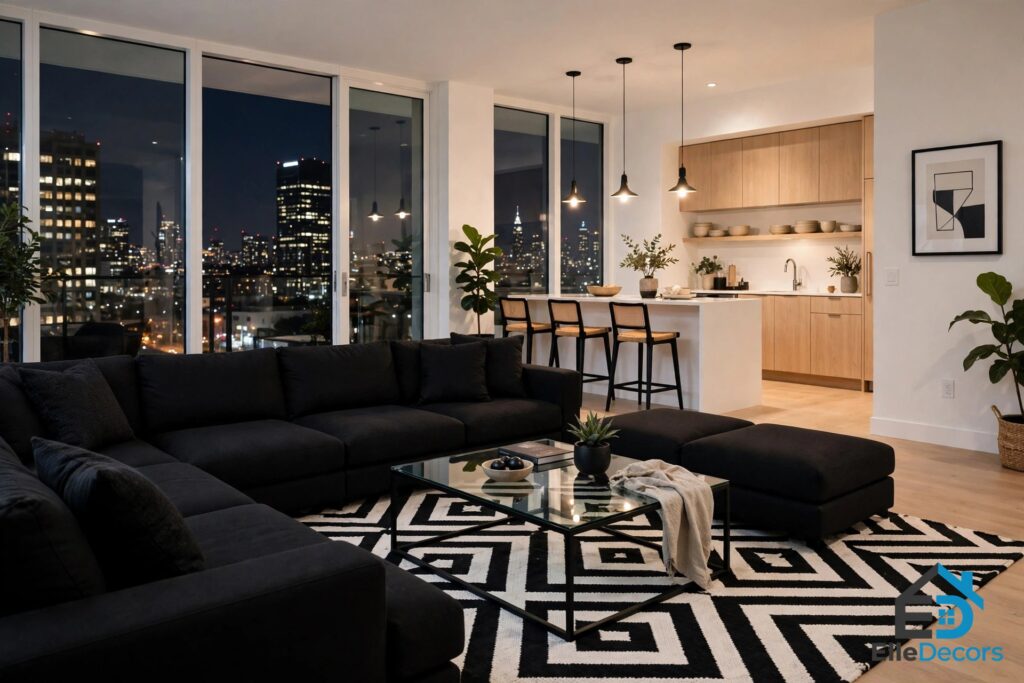
To see the whole palette working in one real home, watch Grig Stamate’s tour of a modern black-and-white apartment: two bedrooms, an open living, dining, and kitchen space, a gas fireplace, and a west-facing terrace. The tour shows the decisions this guide describes — white walls, a black sectional sofa, geometric rugs, and white kitchen cabinets with black countertops — in a single lived-in space.
Video: Grig Stamate tours a modern black and white apartment with an open-plan living space and terrace.
Frequently Asked Questions
What is the best ratio for a black and white interior?
For most rooms, a black and white interior works best at roughly 70 percent of one color, 20 percent of the other, and 10 percent of a softening accent such as wood, brass, or a muted gray-green. White-dominant feels airy and suits living rooms and small spaces; black-dominant feels intimate and suits studies and dining rooms used mostly at night. A near-even split works only in kitchens and baths.
Should I use true black or a soft off-black on the walls?
For most rooms, a soft off-black or charcoal reads richer and less flat than a true black. Reserve a true black like Tricorn Black or Onyx for trim, frames, and graphic accents. Powder rooms are the exception, where near-black on every wall creates a jewel-box effect.
Do the black and the white need matching undertones?
Yes, this is the detail that makes or breaks the scheme. Pair a warm black with a creamy white, or a cool black with a clean blue-white. Staying inside one undertone family keeps a monochrome scheme looking cohesive.
How do I keep a monochrome room from feeling cold?
Choose warm versions of both colors first — White Dove plus a soft brown-leaning black like Iron Ore — then add a third warm element: wood, brass hardware, and natural textures like linen and wool. One quiet accent color in textiles breaks the starkness without abandoning the scheme.
Can I add color to a monochrome room?
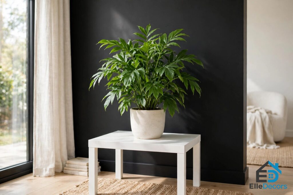
Yes, in small doses. Plants are the easiest addition — greenery always makes a fabulous accent against black and white. Flowers, a single colored cushion, or art with one strong color can soften the contrast. Keep it to one accent per room.
The Bottom Line
A black and white interior rewards patience more than boldness: pick a dominant color, match your undertones, and let wood, brass, and texture do the warming. Start with one room and get the ratio right there before you carry it through the house. The six homes in the source tour prove the same point: the palette never goes out of style, but only rooms with a clear ratio, matching undertones, and a warm third tone actually feel like home.