Warm Color Interior: How to Build a Cozy, Sunlit Home
Some rooms feel warm the moment you walk in: the light looks golden and the walls feel close in a good way. That feeling is no accident. A warm color interior is built on purpose, from colors on the warm side of the color wheel, and it works in almost any home.
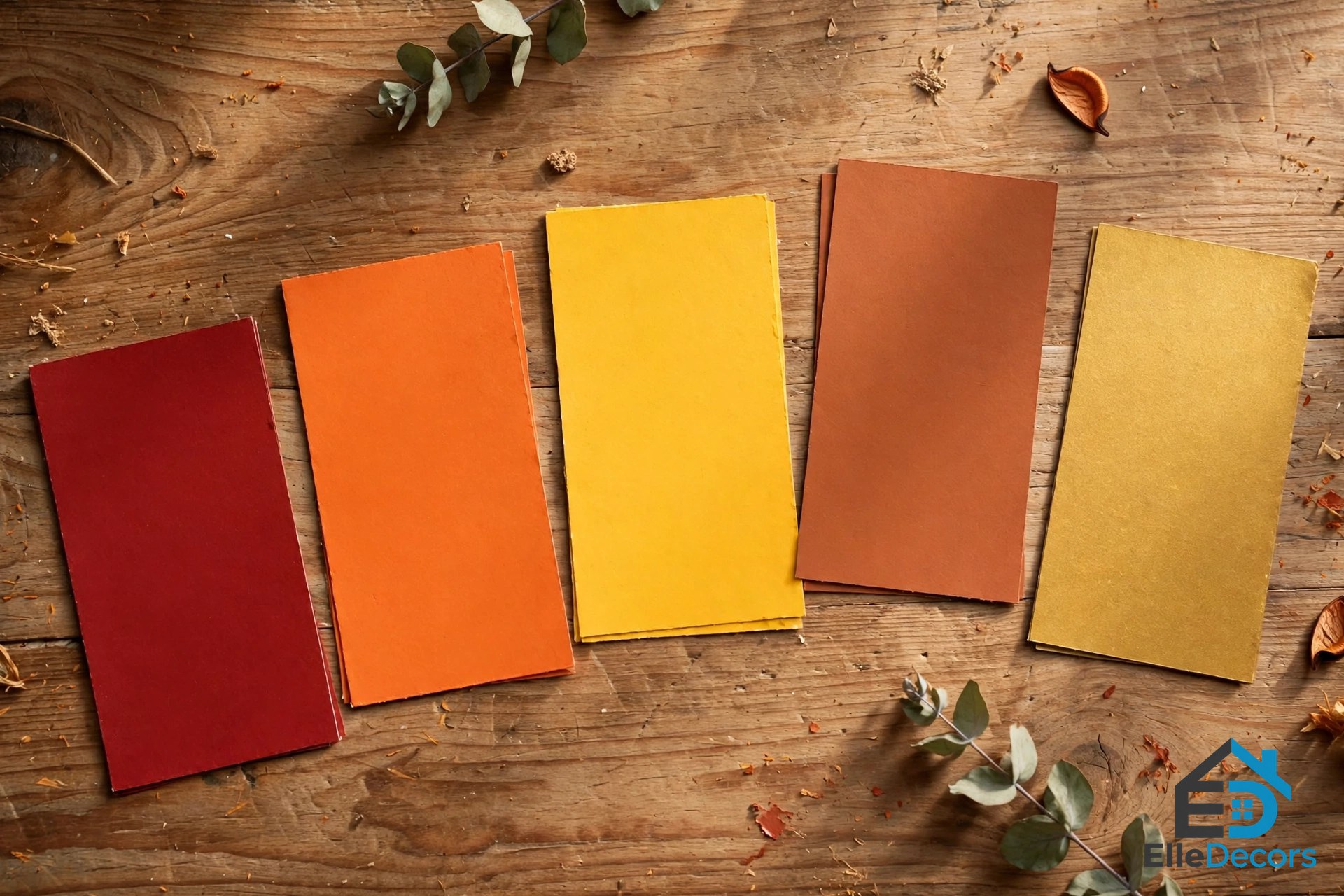
Warm colors are the shades linked to sunlight and fire: reds, oranges, and yellows, plus earthy tones such as terracotta, rust, ochre, peach, coral, and gold. Even a soft beige with a yellow undertone counts as warm. Used well, they make a large room feel more intimate and a plain room feel more alive; used badly, they can make a small room feel tight and a bright room feel loud. This guide shows you how to get the balance right.
What Counts as a Warm Color?
On a traditional color wheel, the warm side runs from red through orange to yellow, while cool colors sit opposite: blues, greens, and violets. The difference is relative. An olive green can look warm next to a blue-green, and a pink can lean warm or cool depending on what sits beside it. What matters is the undertone: a red, orange, or yellow base reads as warm.
Warm colors also change how a room feels in size. Because they seem to advance toward you, they draw the walls in, so a warm scheme can make a wide living room feel like a proper gathering place. Dark warm tones need care in small rooms, where they can make the walls feel closer than you want.
Saturation sets the mood. Deep, saturated warm tones energize a room, so they suit places where people gather and talk. Muted versions calm a room down: a dusty terracotta or a pale peach gives warmth without the shout, which is why softer warm tones suit bedrooms and quiet corners.
Think of warm color as an ingredient, not a coat of paint on every wall. One accent wall, a warm rug, a leather chair, or even warm-toned light bulbs can shift the whole mood.
Three Warm Color Interior Palettes That Always Work
A good palette has three parts: a base color that covers most of the room, an accent that brings the warmth, and a grounding color that keeps everything from floating away. Each warm color interior palette below follows that pattern, so you can copy one as it stands or swap in a shade you like better. All three keep the same rule: the colors share warm undertones, so they sit comfortably together even when they differ in strength.
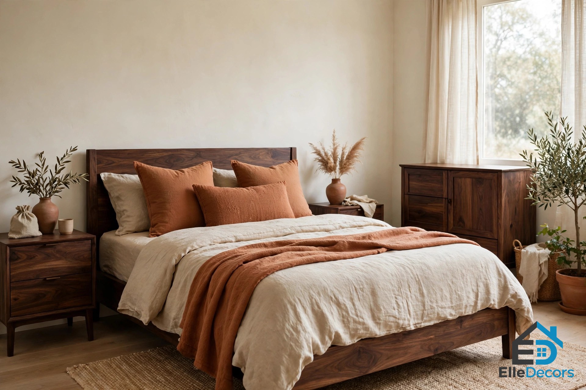
1. Earthy Terracotta
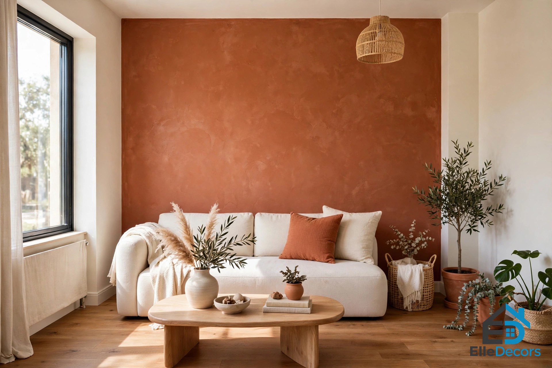
This is the most forgiving warm palette, and the best starting point for beginners. The base is warm white or cream on the walls, which keeps the room bright. The accent comes through terracotta, burnt sienna, and rust in textiles and decor: cushions, throws, a rug, or a single painted wall. Dark walnut timber or charcoal grounds the scheme through furniture and flooring.
Terracotta feels grounded and natural, pairs well with cane, jute, clay decor, and indoor plants, and looks right in rustic and modern rooms alike. In a living room, try a terracotta accent wall behind the sofa and keep the ceiling and the other walls light. In a bedroom, keep the terracotta in the bedding and a single cushion, and let cream walls do the rest.
2. Golden Warmth
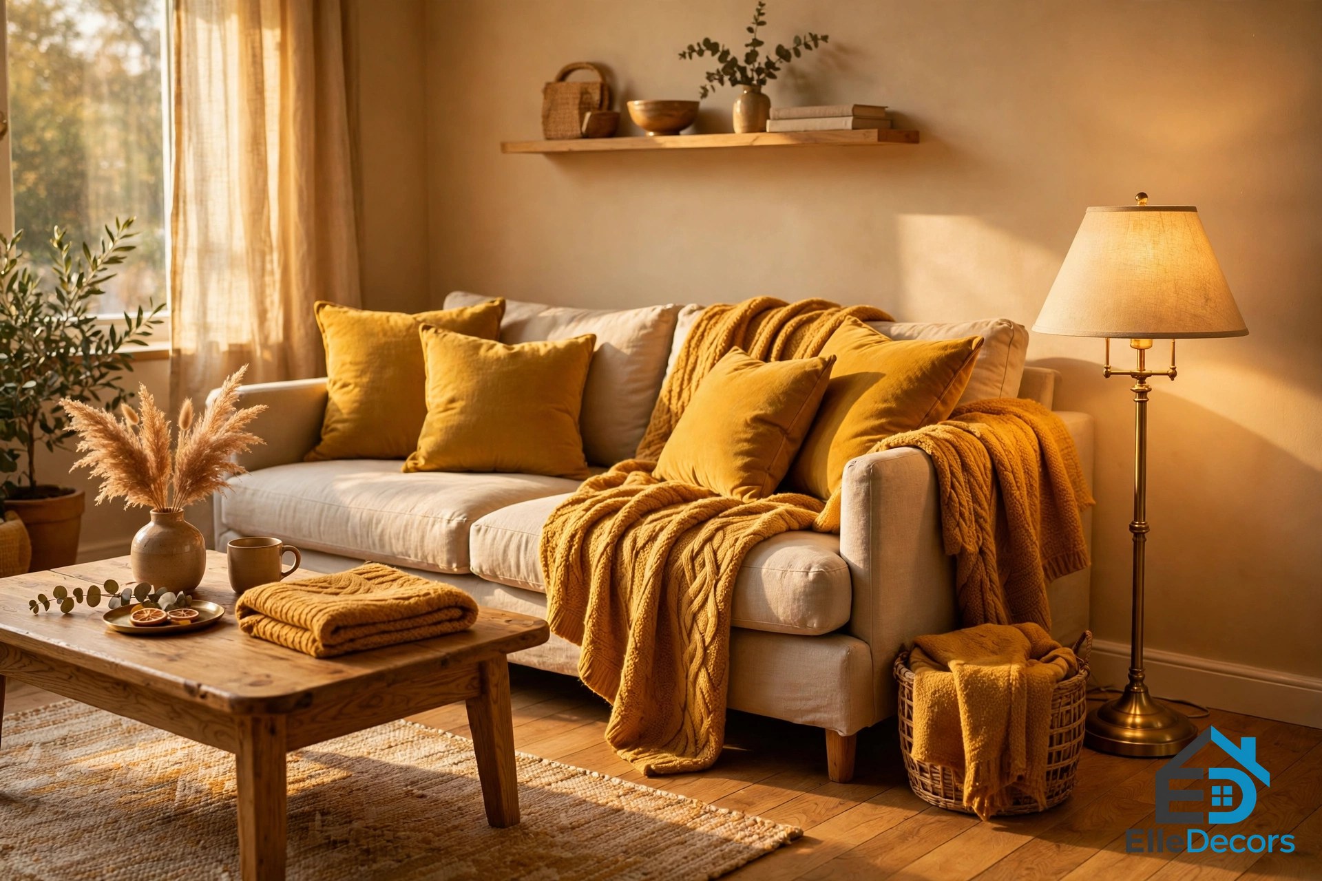
Golden warmth is the sunny one. The base is soft sand or warm beige on the walls. The accents are mustard, amber, and honey, brought in through cushions, throws, and artwork. Natural oak flooring and brass metallic accents ground it.
Handle mustard with care: a little goes a long way, so keep it to cushions, a throw, or one piece of art rather than a whole wall. Buttery, muted yellows are easier to live with than bright ones, and they pair well with warm greys and soft creams.
3. Blush and Caramel
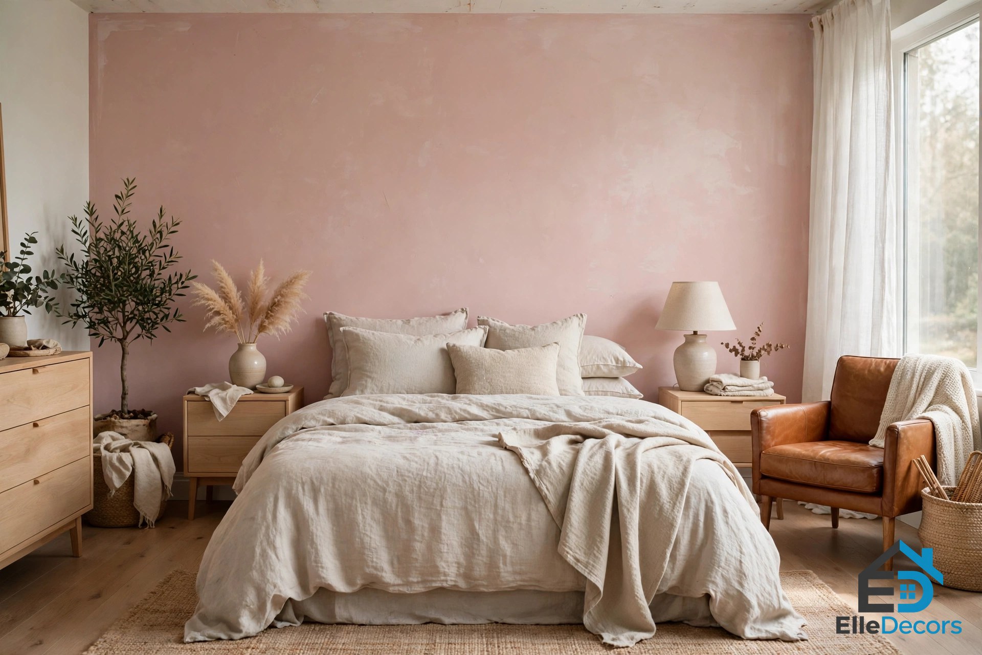
Blush and caramel is the softest of the three, and the best choice for bedrooms and calm living rooms: a soft blush or dusty rose feature wall, the other walls in warm white, caramel, tan, and cognac leather as the accent, and light timber with warm grey tones grounding the room.
Cognac leather is the star here. A leather armchair or a tan leather sofa adds instant warmth and ages well, picking up character as it wears. Pair it with linen bedding in oatmeal or warm white and warm timber bedside tables, and the result feels gentle rather than bold.
| Palette | Base | Accent | Grounding |
|---|---|---|---|
| Earthy Terracotta | Warm white or cream walls | Terracotta, burnt sienna, rust | Dark walnut timber, charcoal |
| Golden Warmth | Soft sand or warm beige walls | Mustard, amber, honey | Natural oak flooring, brass |
| Blush and Caramel | Soft blush feature wall | Caramel, tan, cognac leather | Light timber, warm grey |
Room by Room: Where Warm Tones Work Best
A warm color interior suits every room, but each room wants a different strength: social rooms can take the boldest shades, resting rooms want the softest.
Living Room
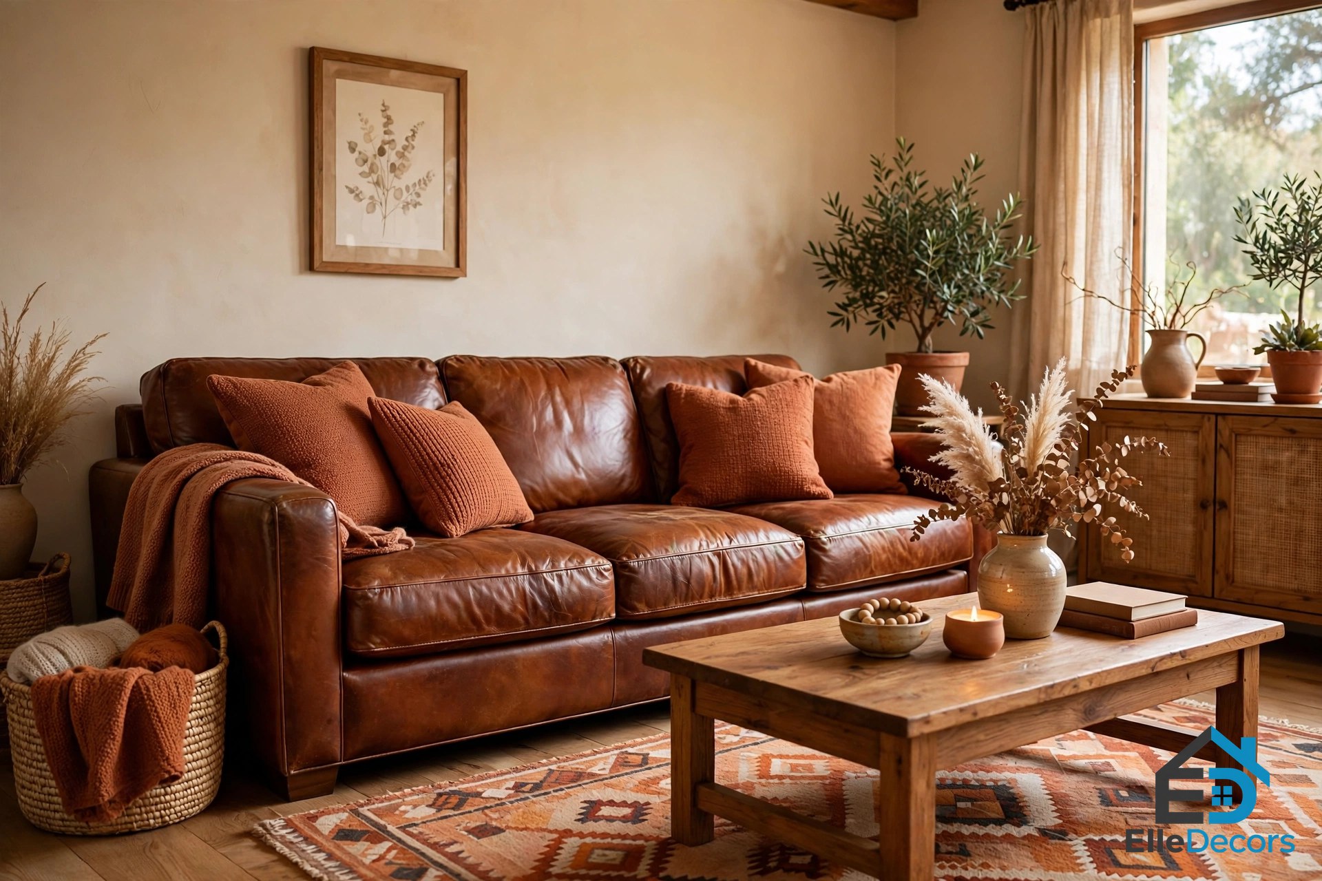
The living room is the natural home for a warm color interior. It is where people gather, talk, and relax, and a warm color interior here encourages exactly that. Start with a warm neutral base on the walls, such as a warm beige or a soft cream, and add one stronger accent: a deep terracotta or rust wall behind the sofa or the television gives the room a focal point without overwhelming it. Keep the ceiling and the walls beside it lighter so the room stays airy.
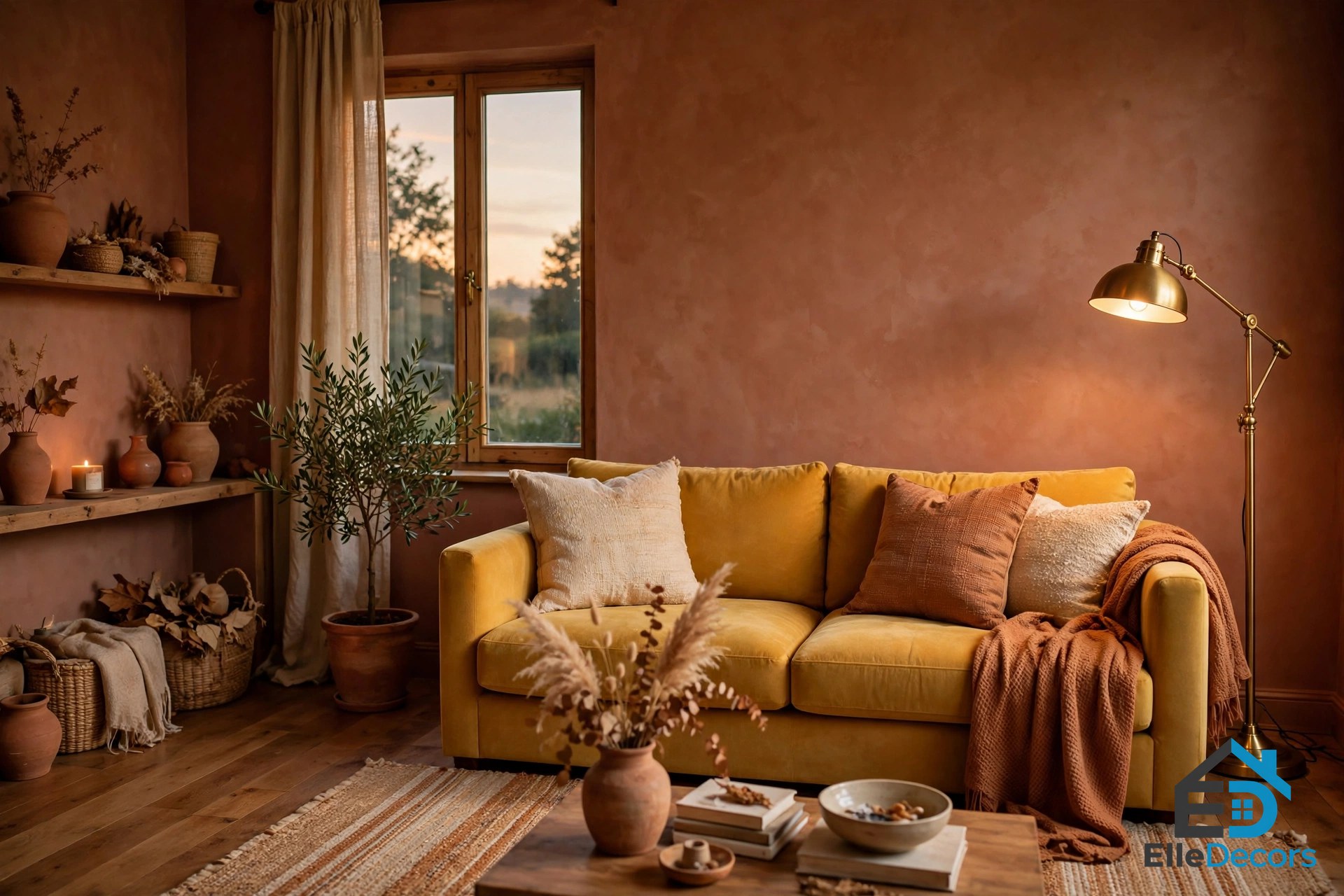
A classic cognac leather sofa is the easiest single piece for a warm living room, adding warmth even against pale walls. If you prefer fabric, look for warm grey, oatmeal, or muted olive green. Then layer textiles: throw pillows and blankets in mustard yellow, burnt orange, or deep red, and a plush rug with warm undertones to tie the seating area together.
Bedroom
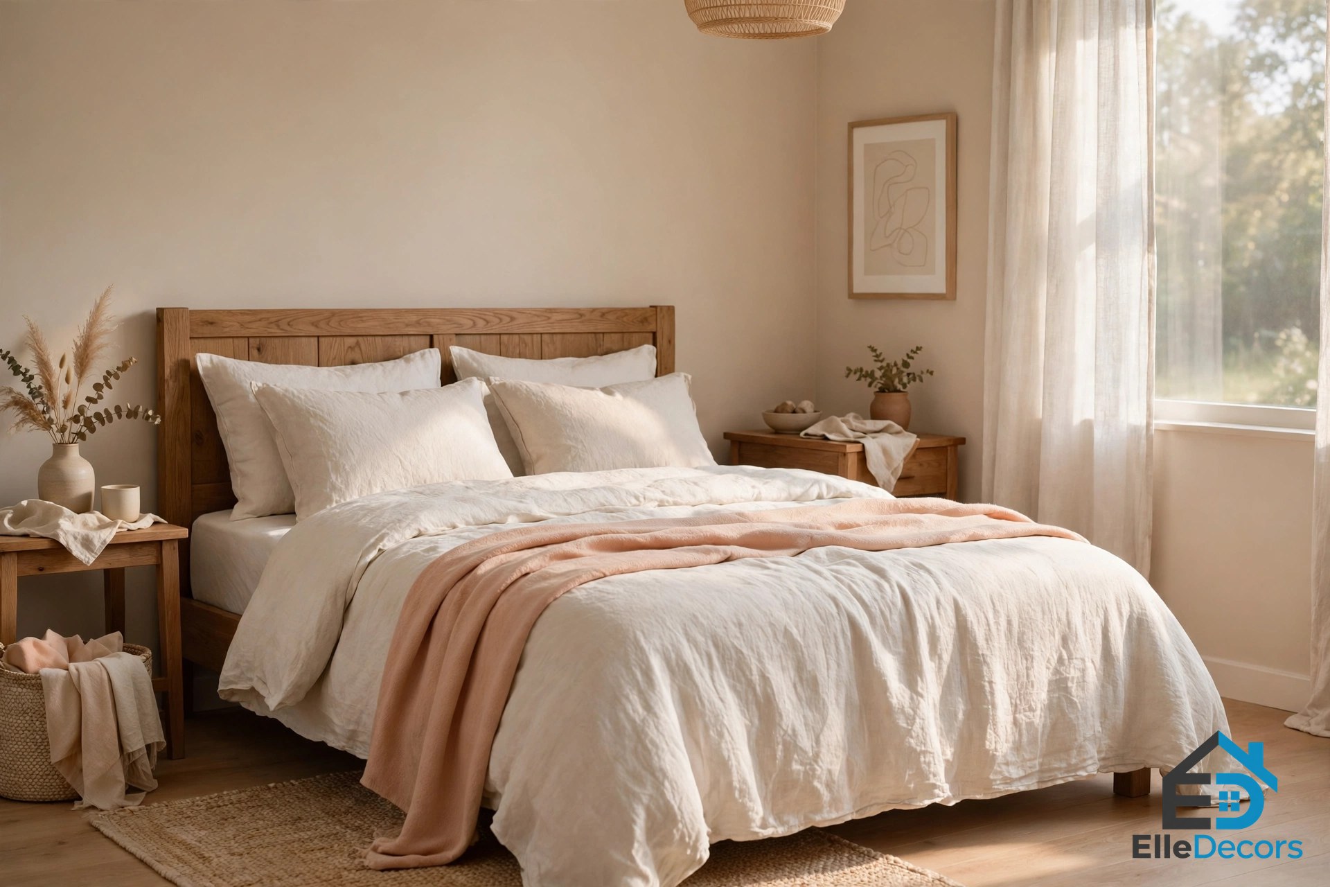
For a bedroom, a warm color interior means softer shades and less of them: peach, soft coral, warm beige, and light terracotta, with the main walls kept light. A single muted accent wall works well, but a whole bedroom in deep red will fight your sleep.
Pair warm walls with off-white linen bedding, a wooden headboard, and soft curtains. An upholstered headboard in a warm-toned fabric can become the room’s focal point without any paint at all. Layer the bed too: crisp white or cream sheets, a duvet cover in soft peach or taupe, and a chunky knit throw at the foot of the bed.
Kitchen and Dining Room
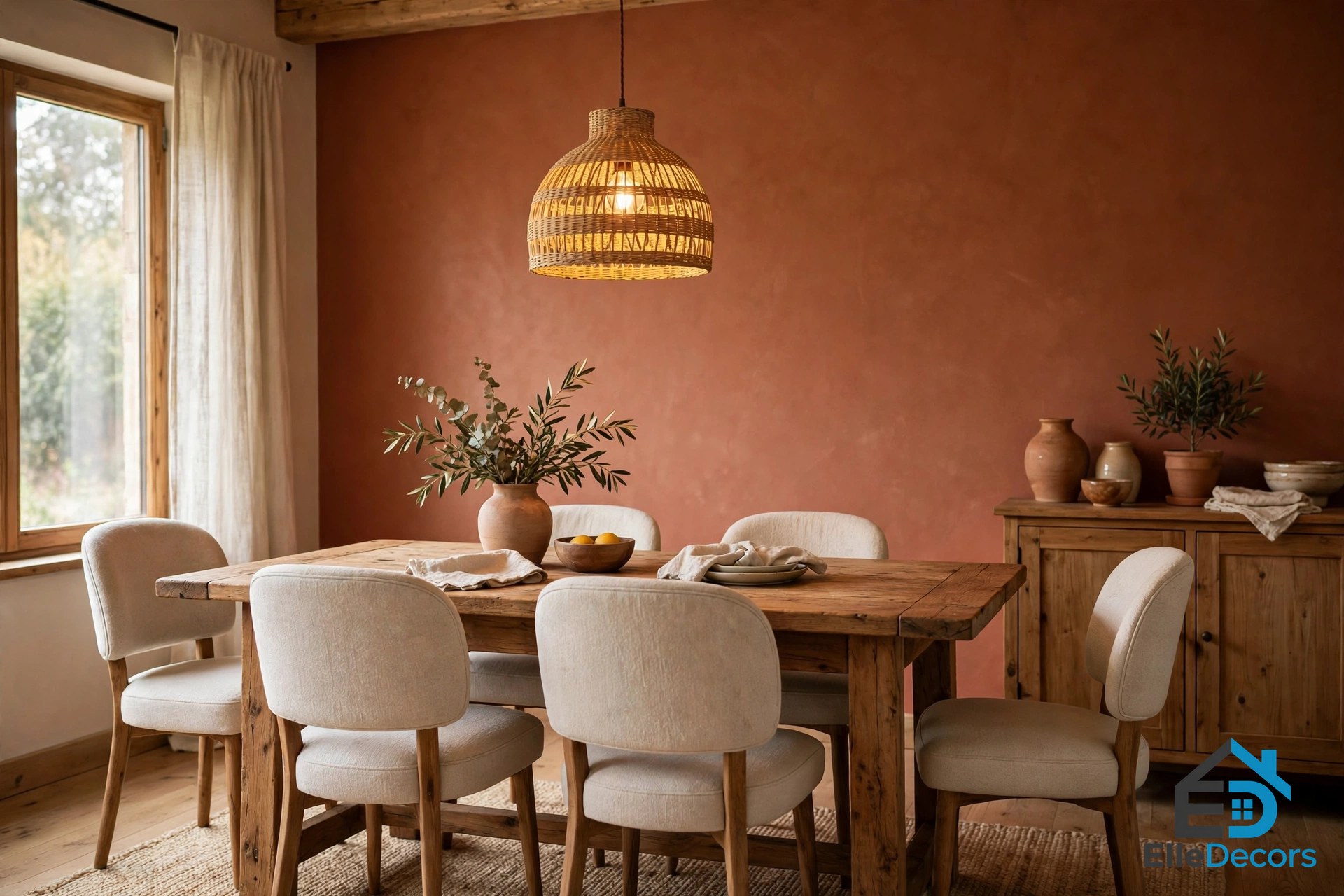
Warm colors lift appetite and energy, so they suit kitchens and dining rooms well. A warm color interior in the dining area might mean brick tones, mustard yellow, or warm orange in controlled doses: a painted wall, upholstered dining chairs in a rich fabric, or a timber dining table with a warm-toned pendant light above it.
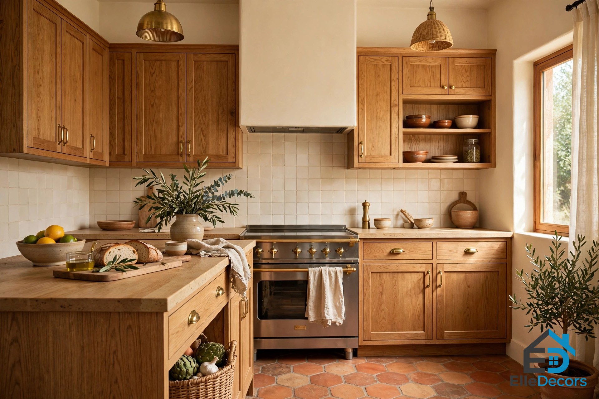
In the kitchen, keep most walls light for easy cleaning and add warmth through materials instead. Natural wood cabinets, especially in oak, cherry, or walnut, are a primary source of warmth. Terracotta floor tiles or a warm travertine backsplash add an earthy, Mediterranean feel. Brass, copper, or gold hardware acts like jewelry for the kitchen: small touches that warm the whole room.
Bathroom and Entryway
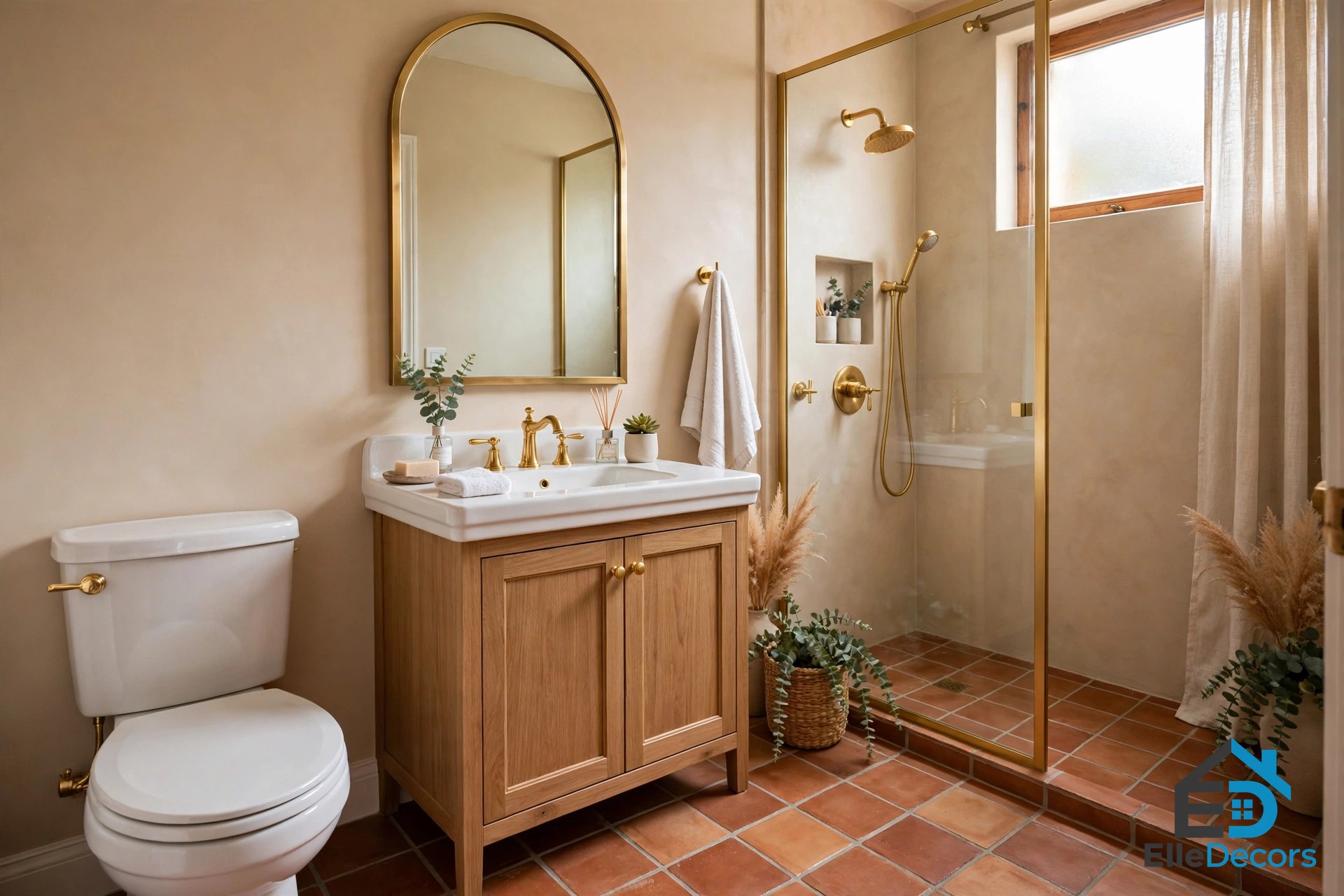
A warm color interior works surprisingly well in bathrooms, since tile lets you go bold in a small dose. Orange tiles under a vanity or a terracotta feature wall can make a bathroom feel cozy instead of clinical, while white sanitaryware cuts crisply through the scheme and gold fixtures warm beige tile. Entryways are the other easy win: a deep red accent wall, a golden sconce, and a wooden console table set a welcoming tone for the whole home.
Materials That Make Warmth Feel Real
Color alone is only half of a warm room. In a warm color interior, the materials decide whether the warmth feels real or just painted on. Natural timber is the classic warm material: oak, walnut, teak, and ash each bring a different warmth, from pale honey to deep brown. Wooden floors, a walnut coffee table, or oak shelves warm a room even with white walls. For the wider picture on using wood across a home, see our guide to the best use of wood in modern designs.
Leather and stone add their own warmth: a well-worn leather armchair, a travertine fireplace surround, or a warm-toned granite countertop all carry color in their material, not just on their surface. Warm metals work the same way: brass, copper, gold, and bronze hardware adds a quiet glow, and brushed or aged finishes often look more modern than highly polished ones.
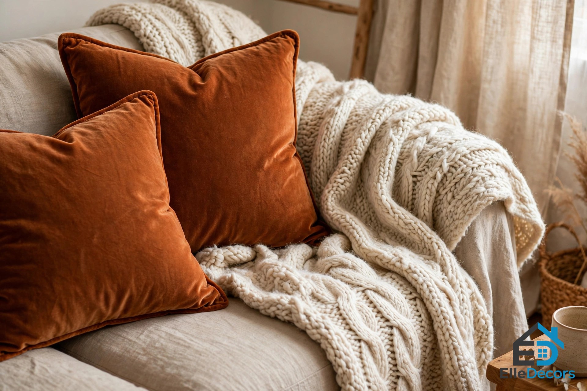
Textiles are where a warm palette comes alive. Velvet in rust or amber, linen in natural oatmeal, cotton in warm white, and wool in caramel each add a different kind of softness. The trick is to layer them: a room of only flat, smooth surfaces can feel sterile even when the colors are warm. Combine a chunky wool blanket, velvet cushions, a smooth wooden coffee table, and a woven basket for plants, and the room starts to feel rich and lived-in.

Lighting: The Warmth You Can Switch On
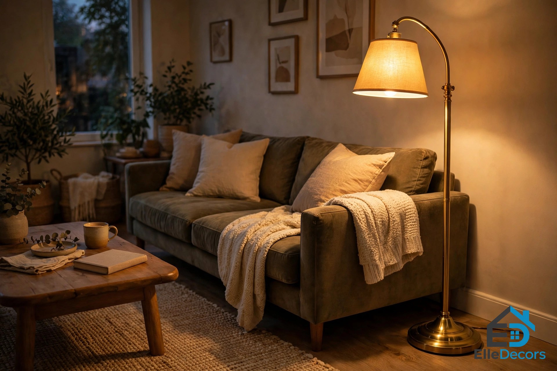
Lighting changes how every warm color in your home looks, so it deserves as much thought as the paint. Bulbs around 2700K give a soft, yellow-tinged light that makes a warm color interior glow and feels much more relaxing than harsh, cool light. Above 4000K, light turns white then bluish, which fights the palette and flattens terracotta.
Layer the light the way you layer the textiles: soft ambient light from the ceiling, focused light from a reading lamp or a pendant, and low-level mood light from candles or a small table lamp. A golden wall sconce or a brass floor lamp does double duty, adding both warm light and a warm metal finish to the room.
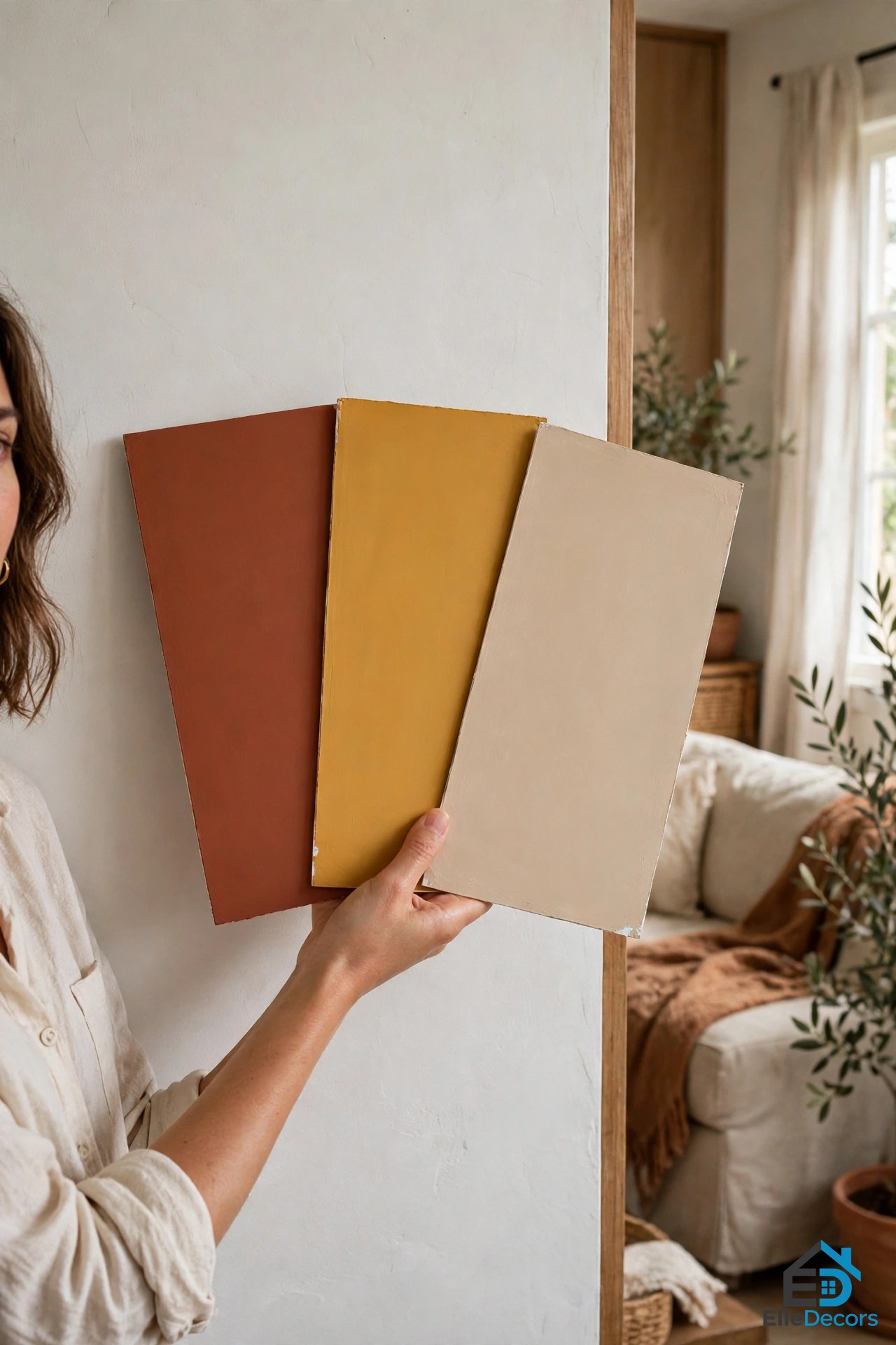
Daylight matters just as much. Warm colors shift through the day, so test samples in morning and afternoon daylight and under the bulbs you plan to use before you commit. Paint a large sample board and move it around the room, checking it against the curtains, flooring, and furniture.
This video shows why warm and cool tones work best together, and how their contrast adds depth to a room:
Mistakes to Avoid
- Painting every wall a strong warm color. One accent wall changes a room; four strong walls close it in. Keep most walls light and let one wall, or the furniture and textiles, carry the warmth.
- Going dark in a small, dim room. Deep reds and dark rusts drink up light. In tight spaces, choose lighter warm shades such as soft peach, warm off-white, or light beige, and keep the lighting good.
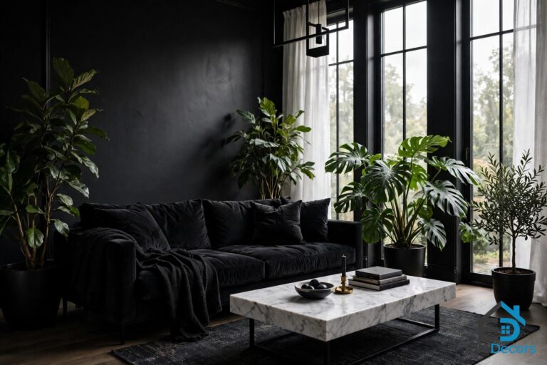
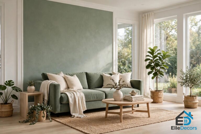
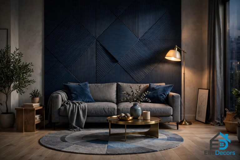
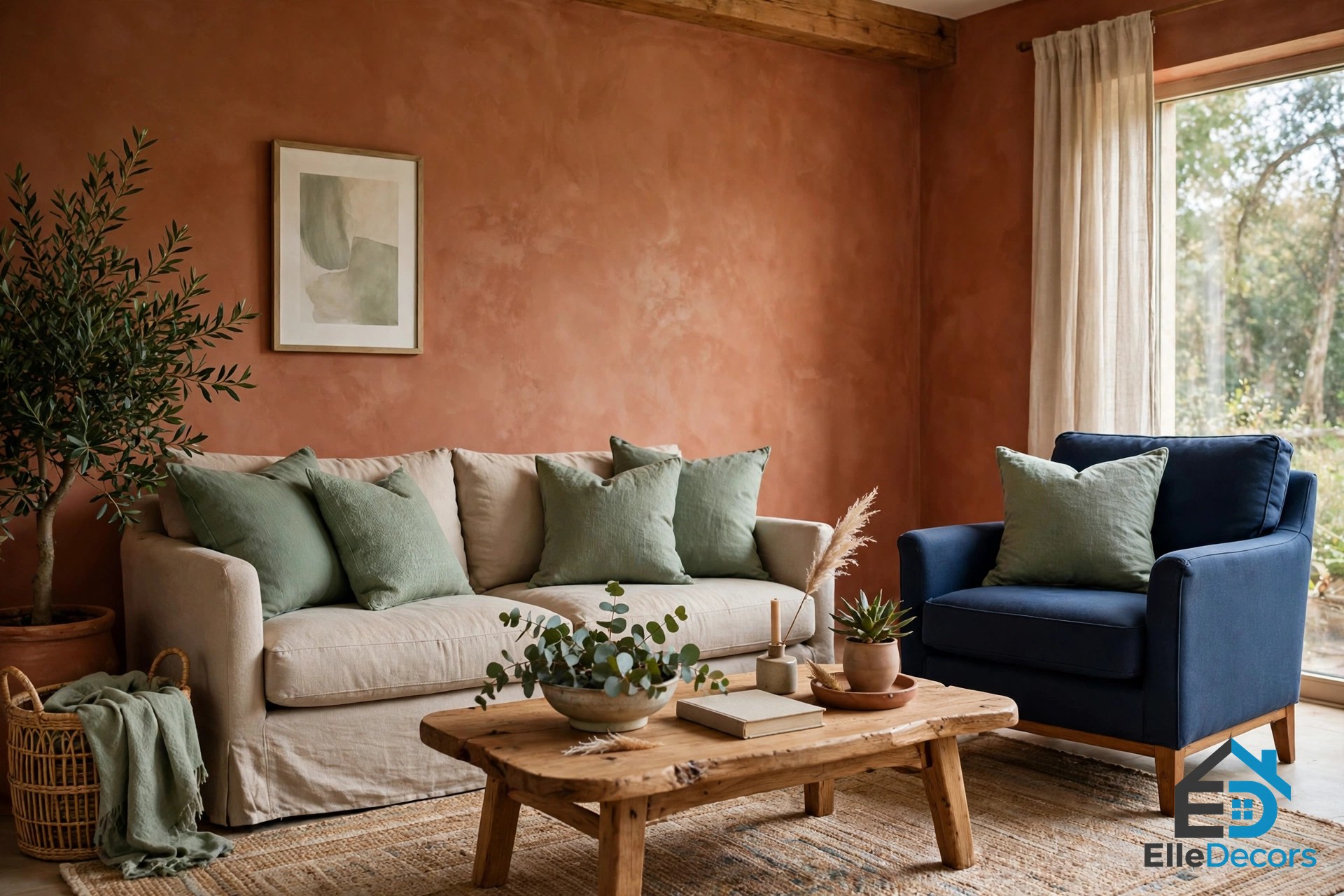
- Forgetting the cool contrast. A room in warm tones only can feel flat and heavy. A touch of sage green, dusty blue, navy, or charcoal gives the warm colors something to stand against and makes them look richer.
- Mixing clashing undertones. Two warm colors can still fight if one leans pink and the other leans yellow. Hold samples side by side in daylight before you buy.
- Skipping the sample test. Warm paint looks different on a wall than on a small swatch, and different again at night. Test first, or the terracotta you loved in the shop may read orange in your living room.
- Choosing the wrong finish. A matte finish absorbs light and feels calm and velvety, which suits bedrooms. A slight sheen reflects light and makes color look stronger, which suits a feature wall.
Frequently Asked Questions
What colors are considered warm colors?
Red, orange, and yellow are the main warm color families. Related shades include coral, peach, terracotta, rust, ochre, and burgundy, along with warm neutrals such as camel, caramel, and yellow-based ivory. A color counts as warm when its undertone leans red, orange, or yellow rather than blue or green. Warm greys also work: a grey with a taupe or beige undertone sits comfortably beside terracotta and caramel, while a blue-grey can clash.
Can I use warm tones in a small room?
Yes. Dark, saturated warm colors can make a small room feel smaller, but lighter warm tones such as soft peach, warm off-white, or light beige can make it feel cozy and inviting instead of cramped. Keep the lighting good, and use the strongest color on one wall or in textiles rather than on every surface.
How can I add warm tones without painting?
If you are renting or not ready to paint, focus on things you can change easily: a large, warm-colored rug, throw pillows and blankets in mustard or burnt orange, artwork with warm hues, or wood and leather furniture. Even warm-toned light bulbs in your lamps can make a real difference.
What is the easiest way to start with warm color?
Start with textiles and lighting, not paint: a warm rug, a few cushions in terracotta and mustard, and bulbs around 2700K will show you whether you like living with a warm color interior. If you do, the next step is one accent wall in your favorite shade from the palette you chose.
The Bottom Line
A warm color interior is not about painting everything red. It is about choosing a warm base, adding one or two accents with confidence, and grounding the room with timber, leather, or a warm metal. Start with the palette that fits your light and your rooms, test your samples in daylight and at night, and add one cool touch so the warmth has something to stand against.
Still choosing between styles? Browse more ideas for interior decorating for more warm-tone ideas. And if your taste leans rustic, the earthy side of warm color pairs naturally with western home decor, where leather, timber, and layered textiles do much of the warming for you.