Gray and Dark Blue: 12 Stunning Ways to Balance the Moody Pair
AUDIO SUMMARY: Grey and dark blue can look suave and soothing or heavy and sombre, and the difference is balance. This guide draws on two Moscow homes to show twelve ways to get it right — textured panels, ink blue cushions, walnut breaks, brass and oak warmth, and calm bathrooms. Start with grey as the base and let the blue earn its place.
Gray and dark blue is one of the most sophisticated colour pairings in modern interiors, and one of the easiest to get wrong. Two deep shades together can tip a room from suave and soothing to oppressively sombre without the right balance to keep the look in check. This guide draws on two chic, modern Moscow homes that hit this powerful colour combination just right, and turns what they do into twelve practical ideas for a living room, bedroom, kitchen or kids’ room. The first home uses playful texture and atmospheric lighting for energy, while the second reins the blue back into inky blue-grey elements against light wood, classic panel moulding and brass.
What Is Gray and Dark Blue in Interior Design?
Gray and dark blue in interior design means a scheme built on two deep, cool tones: grey as the calming base and dark blue as the dramatic accent. Grey gives blue somewhere to breathe, and blue stops grey from feeling flat. Both colours share cool undertones, so they almost never fight each other. Both absorb light, so too much of either can feel cold and closed in. Every idea below follows the same rule: grey carries the room, blue makes the statement, and warm materials and good lighting keep the balance.
1. Let Grey Carry the Room
Start with grey dominant and blue supporting. In both source homes, grey sofas, grey rugs and pale grey walls do most of the work, while dark blue appears in cushions, panels and cabinetry. A grey base keeps the room calm and gives you freedom to move the blue around later: cushions and throws are easy to swap, a blue wall is not. Gray and dark blue work best in this order, with grey leading and blue accenting. If you are unsure where to begin, paint the walls pale grey, choose a grey sofa, and add the blue in three or four smaller places. The room will read as a grey room with blue character rather than a blue room that feels like a cave.
2. Break Blue With Ribbed Texture
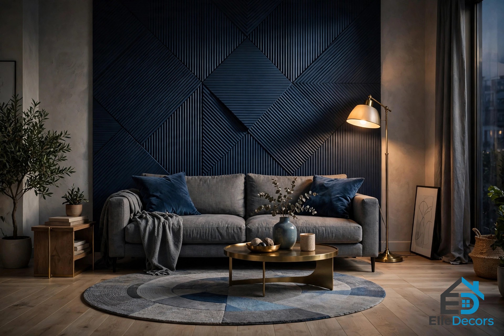
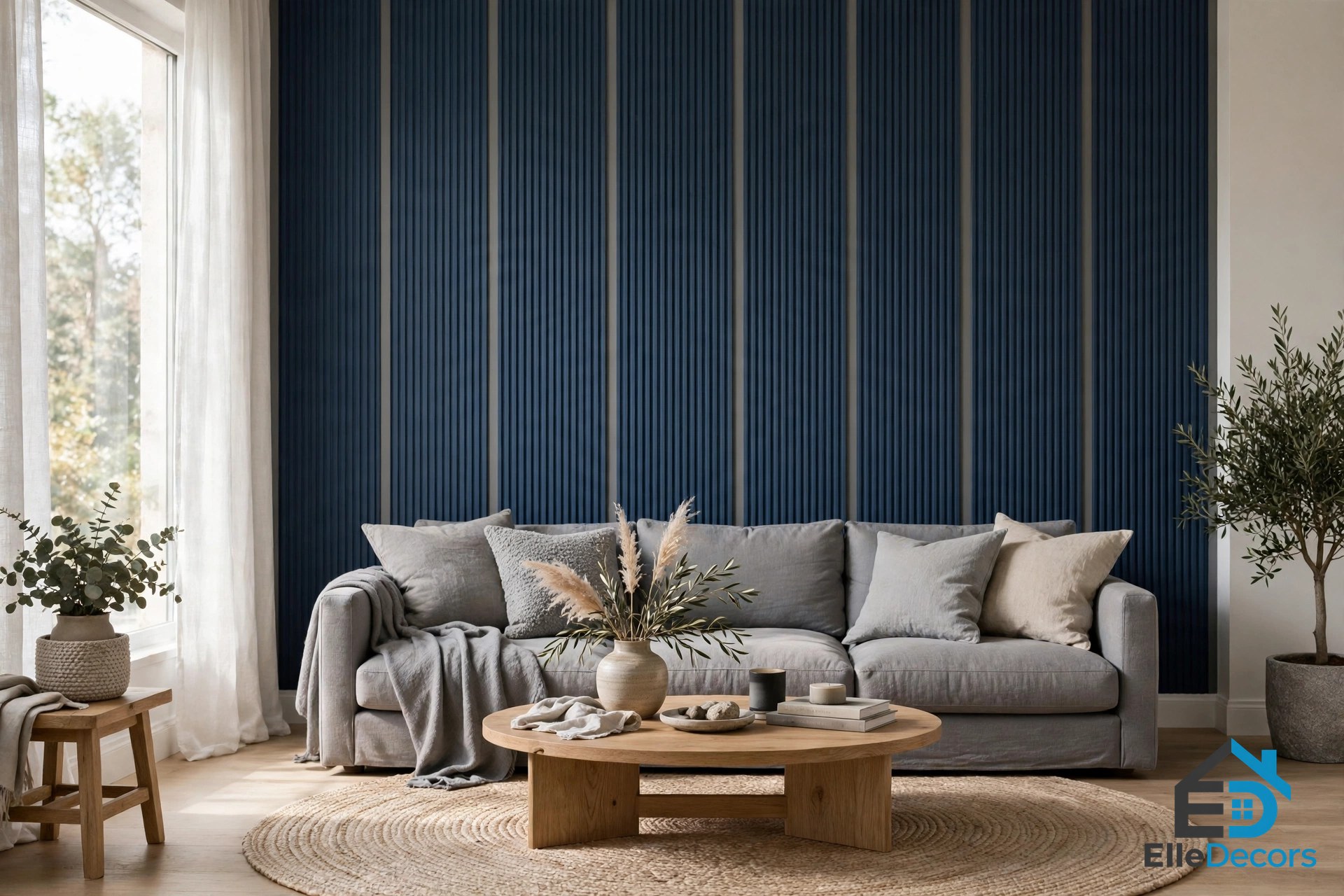
The first Moscow home uses ribbed geometric panels to cut grey pauses between dark blue strips on the feature wall, and the change in texture lightens and energises the shadowy look. Flat blue can feel heavy, but the same blue broken into ribs or flutes catches light and shadow and gives the wall movement. A round rug offsets the sharp geometrics and melds dark blue accents with lighter shades of grey. Fluted panelling, ribbed wallpaper or slatted panels behind the sofa give the same effect.
3. Start With Ink Blue Cushions
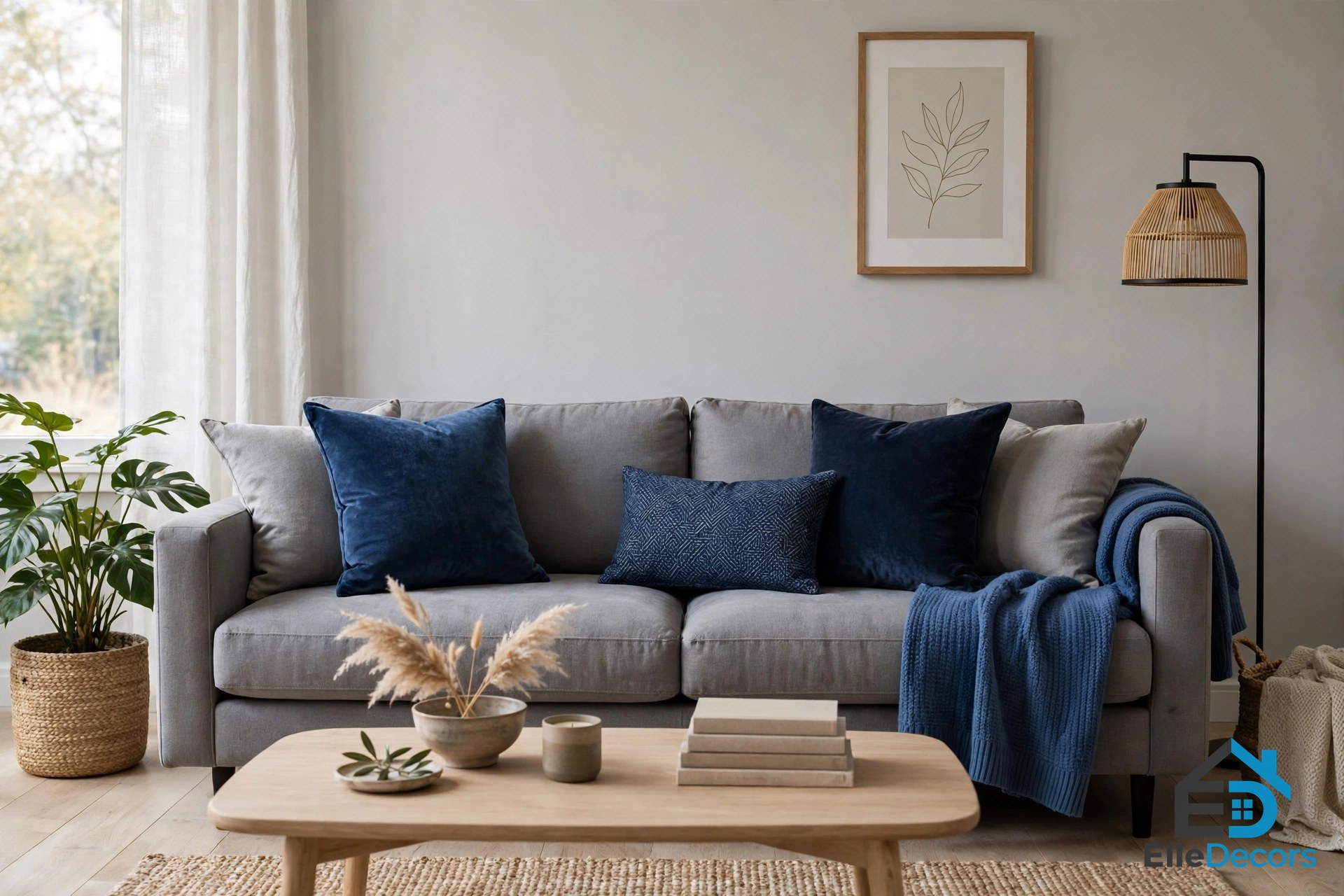
Ink blue scatter cushions are the easiest way to break up a grey expanse of sofa, and they cost almost nothing to try. In the first home, deep blue cushions sit on a grey sofa beside a blue accent chair — bold without committing the whole room. Choose two or three cushions in ink, navy and dusty blue, plus one patterned cushion to tie them together. A blue throw over the arm does the same job for even less effort. If the cushions look right after a week, go further with a blue chair or rug.
4. Add One Blue Accent Chair
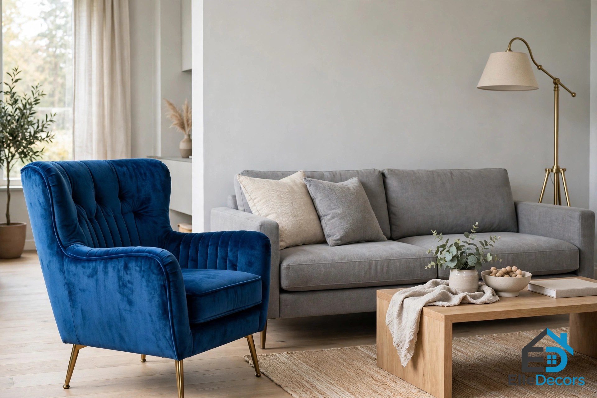
A blue accent chair boldly complements the theme without taking over the room. Place it opposite the grey sofa or angled into a reading corner, and repeat the blue once more across the room — a cushion, a piece of art or a throw — so the chair looks intentional. Velvet works beautifully here because its pile catches the light and makes the blue look richer; leather in the same palette reads more tailored.
5. Build a Blue Bookcase With Walnut Breaks
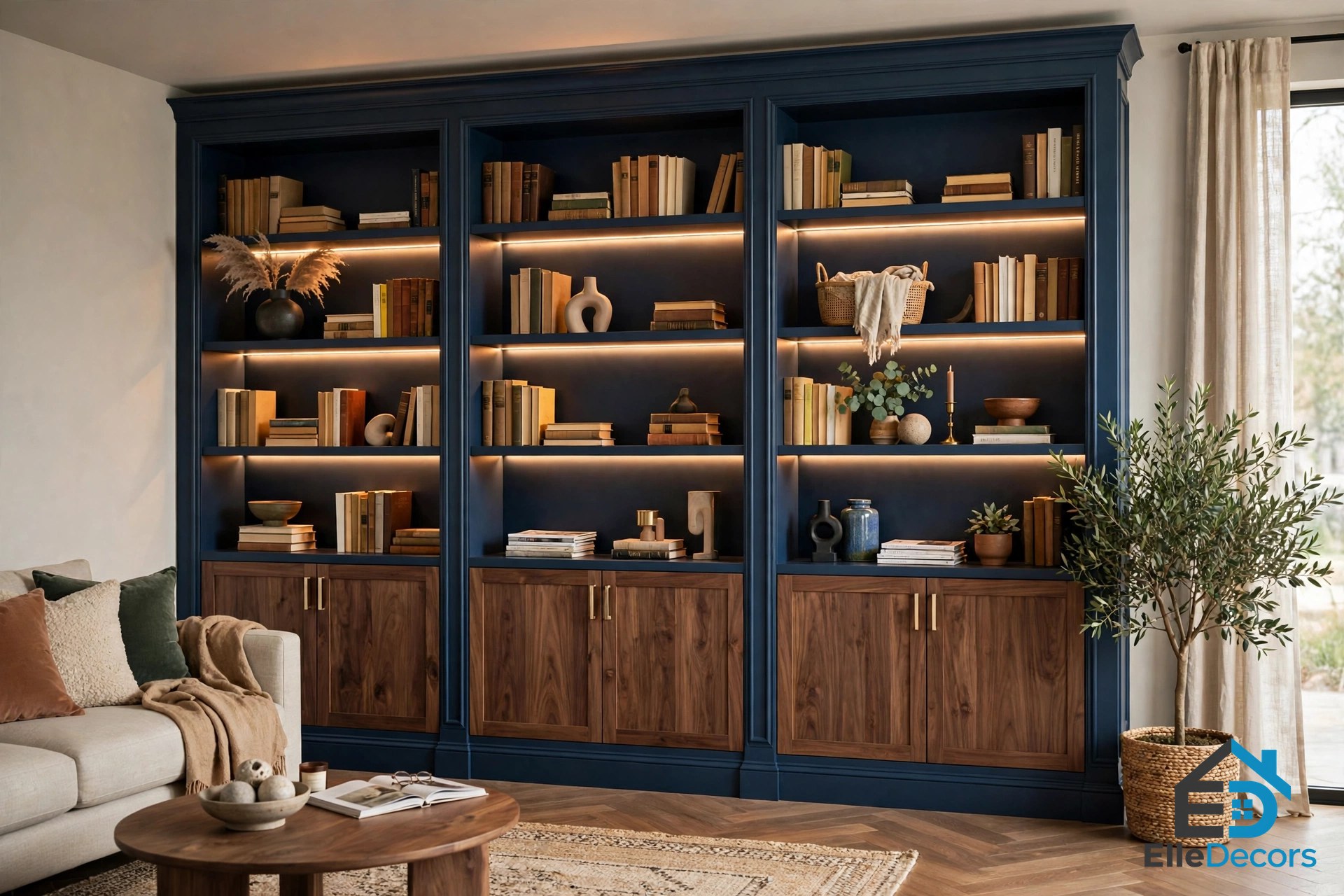
A striking blue bookcase makes sleek inspiration for a deeply colour-saturated scheme, and the first Moscow home shows how to keep it from overwhelming the room. LED strips lighten the look, decorative items break up the blue expanse, and walnut cabinet fronts disrupt the colour continuity. The lesson for any large blue surface is to break it up, so plan the breaks before you paint.
6. Light the Blue, Don’t Just Paint It
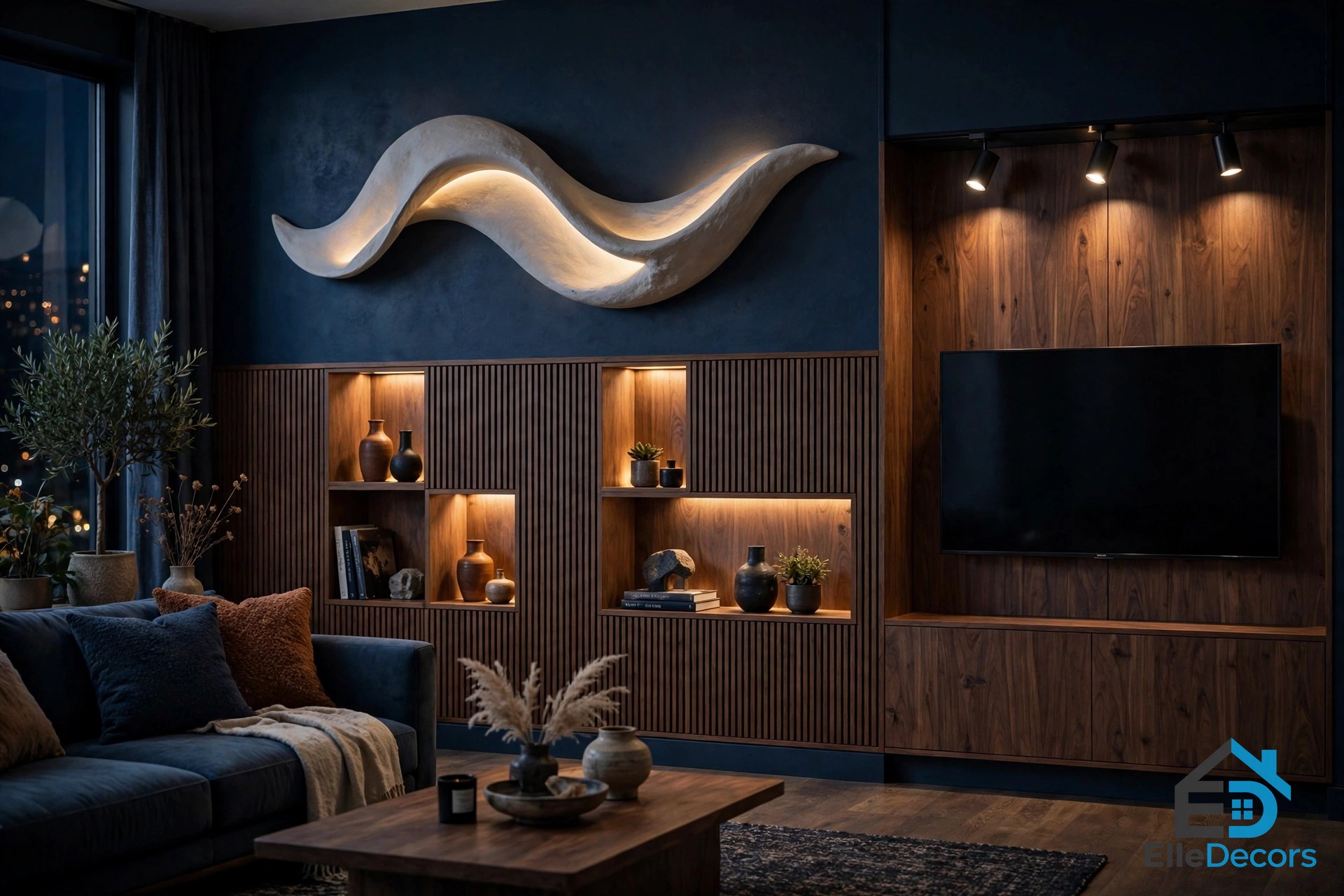
Dark colours absorb light, so lighting is not decoration in this palette — it is structure. In the first home, backlit display nooks add interest to the TV wall against sleek walnut panelling, a freeform wall light waves down one blue feature panel, and directional spotlights illuminate the TV wall unit. Layer your light the same way: overhead spots, LED strips inside shelves and nooks, and one sculptural wall light or floor lamp. Warm bulbs matter here; cool white light on blue-grey walls can feel like an office lobby, while warm light brings out the blue.
7. Soften Blue Into Teal in the Kitchen-Diner
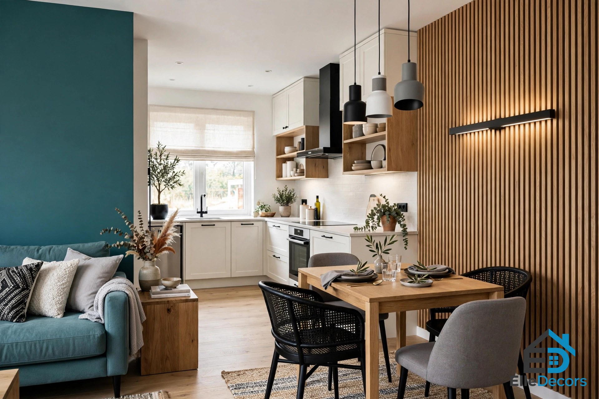
Moving into the kitchen-diner of the first home, the ink blue elements are swapped for moments of teal — a small sofa and a painted wall accent — and a linear wall sconce highlights the teal and wood slatted wall feature. Teal is blue with a touch of green, lighter and fresher than navy, so it works as a bridge colour when the living room is deep blue. A trio of black, white and grey dining pendants ties the two spaces together. In an open-plan home, keep deep blue in the lounge and let a softer teal carry the colour into the dining area.
8. Frame Blue With Black, White and Grey
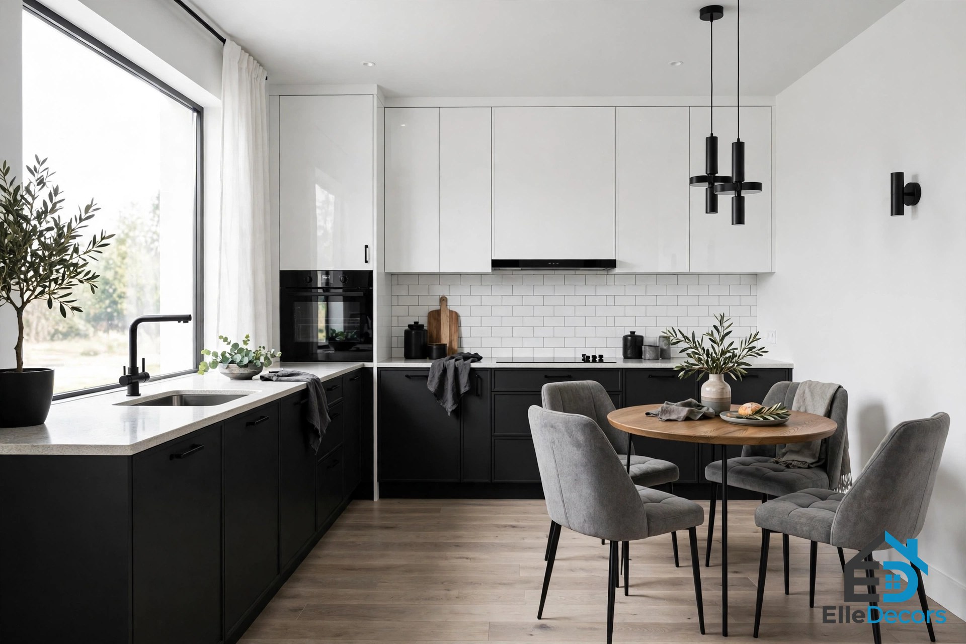
A black, white and grey kitchen draws an L-shape around the small dining spot in the first home, with plush grey upholstered dining chairs across the small kitchen table. The palette is almost monochrome, and the blue appears only in small moments, which is why it works: the room reads as a crisp black-and-white kitchen with blue character rather than a blue kitchen. Our guide to a grey living room shows the same idea in a lounge, where grey does the heavy lifting and blue arrives in accents. When in doubt, frame the blue with neutrals — black for structure, white for air, grey for calm — and let the blue be the surprise.
9. Warm It Up With Brass and Oak
Cool colours need warm materials, and both Moscow homes prove it. In the second home, a round coffee table adds a touch of lustrous brass against a wall of oak wood tone behind the couch. The oak feature wall zones the sitting area within the living room and dining room combination, while inky blue-grey cabinets form a darker backdrop for the eating spot. Brass returns in the dining area, in a linear suspension light and table accents framed by modern black dining chairs, and deep blue-grey kitchen units wear light-catching brass hardware. Add brass in lighting, handles and table frames, and oak in flooring, wall panels and furniture, and the cool palette turns warm and liveable.
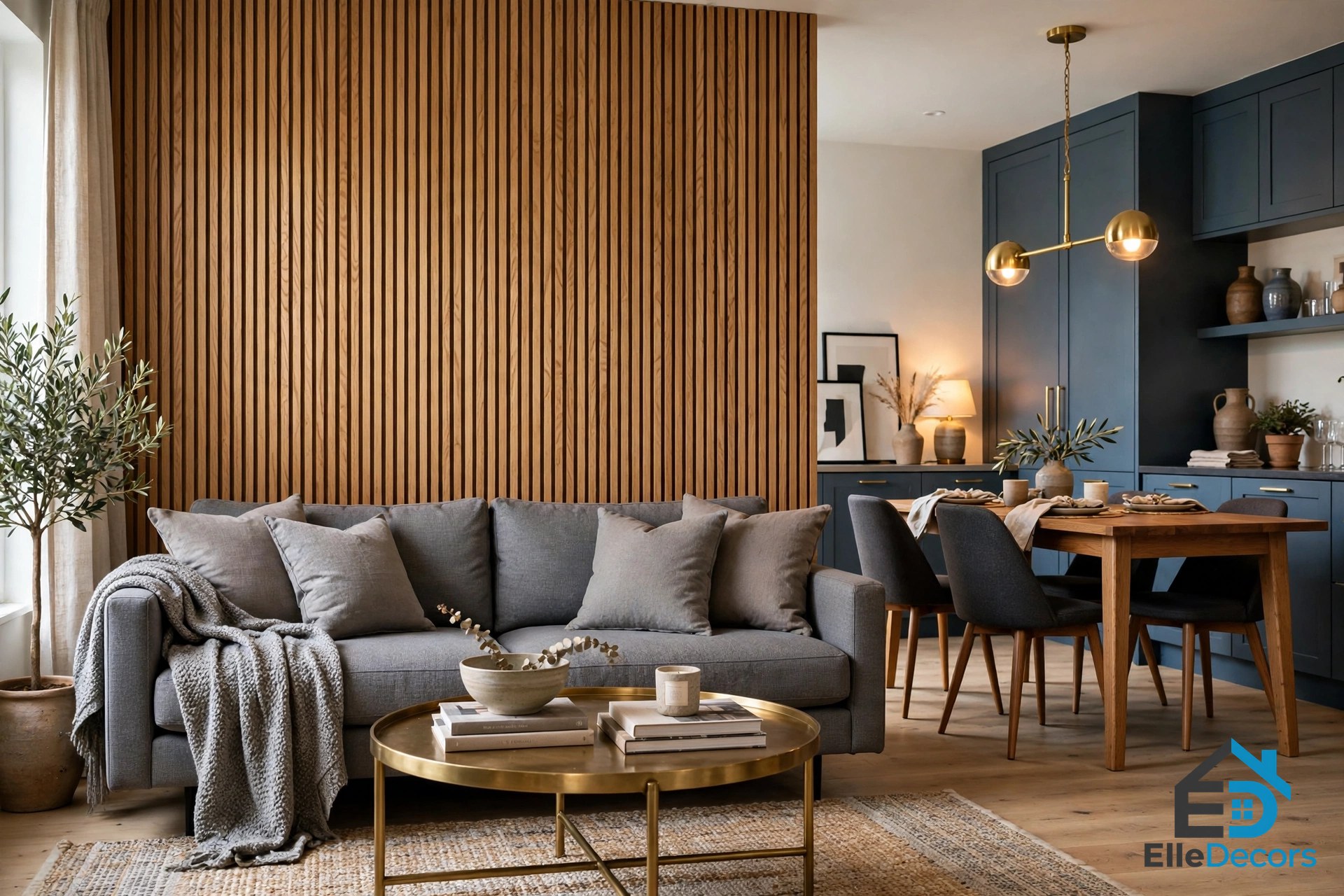
Our guide to warm color interior ideas shows how warm neutrals balance cool palettes in exactly this way.
10. Take the Palette Into the Bedroom
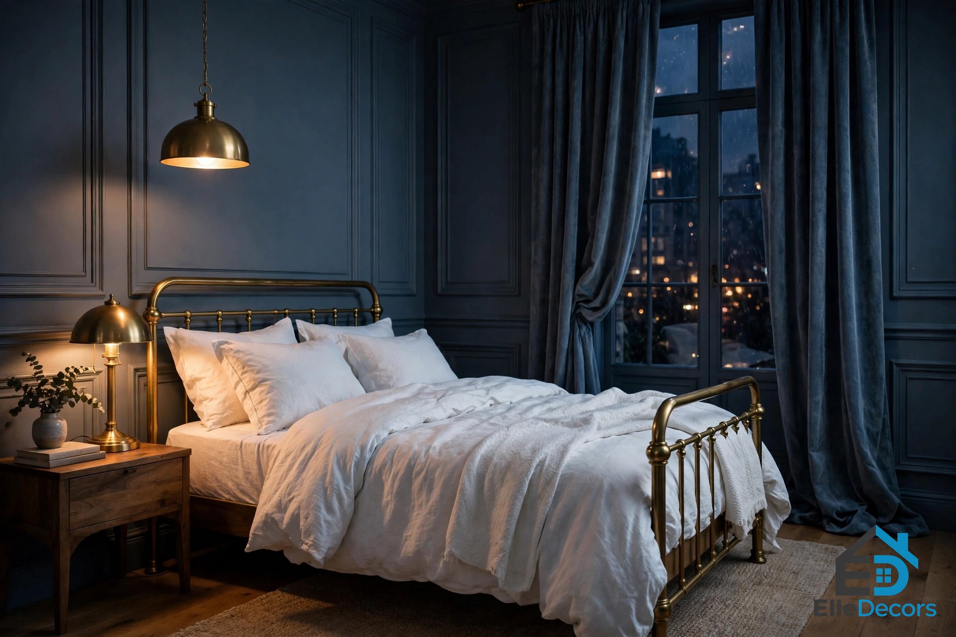
The second home is a 79 square metre apartment where the blue is subdued into moody blue-grey elements, and the bedroom shows how well this palette sleeps. White walls and ceilings, with white scatter cushions on the small sectional sofa, lightly balance the scheme, while panel moulding gives the rooms a classically elegant approach. Inside the dark themed bedroom, a matching pendant light and bedside table lamp shine on a deep blue-grey and smoke decor scheme, and heavy curtains subdue the light from the large window. Keep the bedding pale — white or light grey — so the dark walls feel cocooning rather than heavy, and add one brass lamp or a warm wood bedside table to stop the room feeling cold at night.
11. Keep the Bathroom Calm
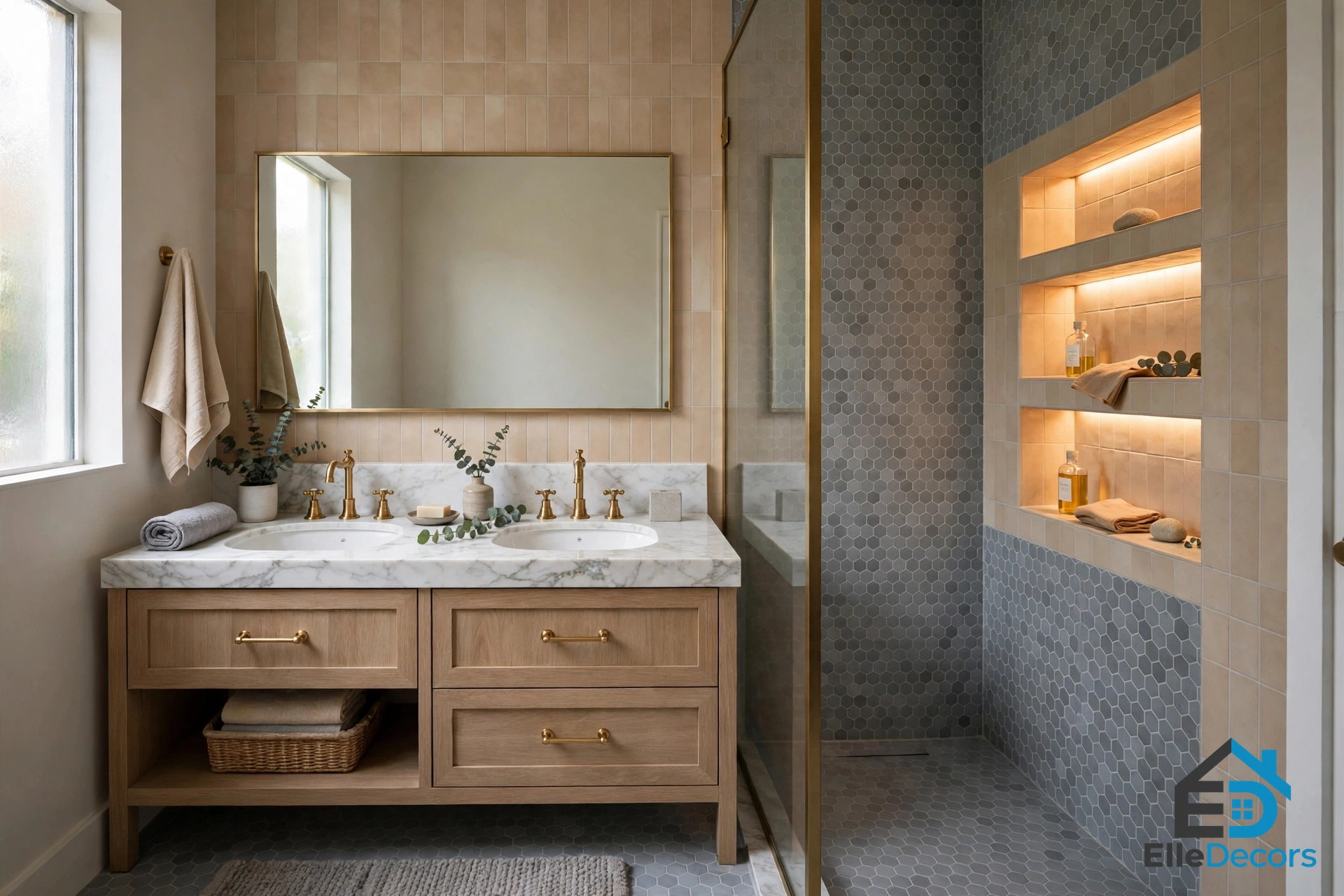
The bathroom is a sanctuary away from the strong, evocative colour palette, and the first home treats it that way. Warm beige and cool grey tiles balance each other in the compact space, and recessed shelves glow inside the shower wall. The second home follows the same instinct: dark grey towels accessorise a modern double sink vanity, oak panels conceal the toilet cistern, and white marble tiles with brass fixtures lighten the grey shower room. The lesson is to step the colour down in wet rooms. Pale grey and beige tiles, white marble and one dark grey note in towels or a vanity are enough — a fully dark blue bathroom in a small space can feel cramped, while a calm grey one feels like a retreat.
12. Try It in a Kids’ Room
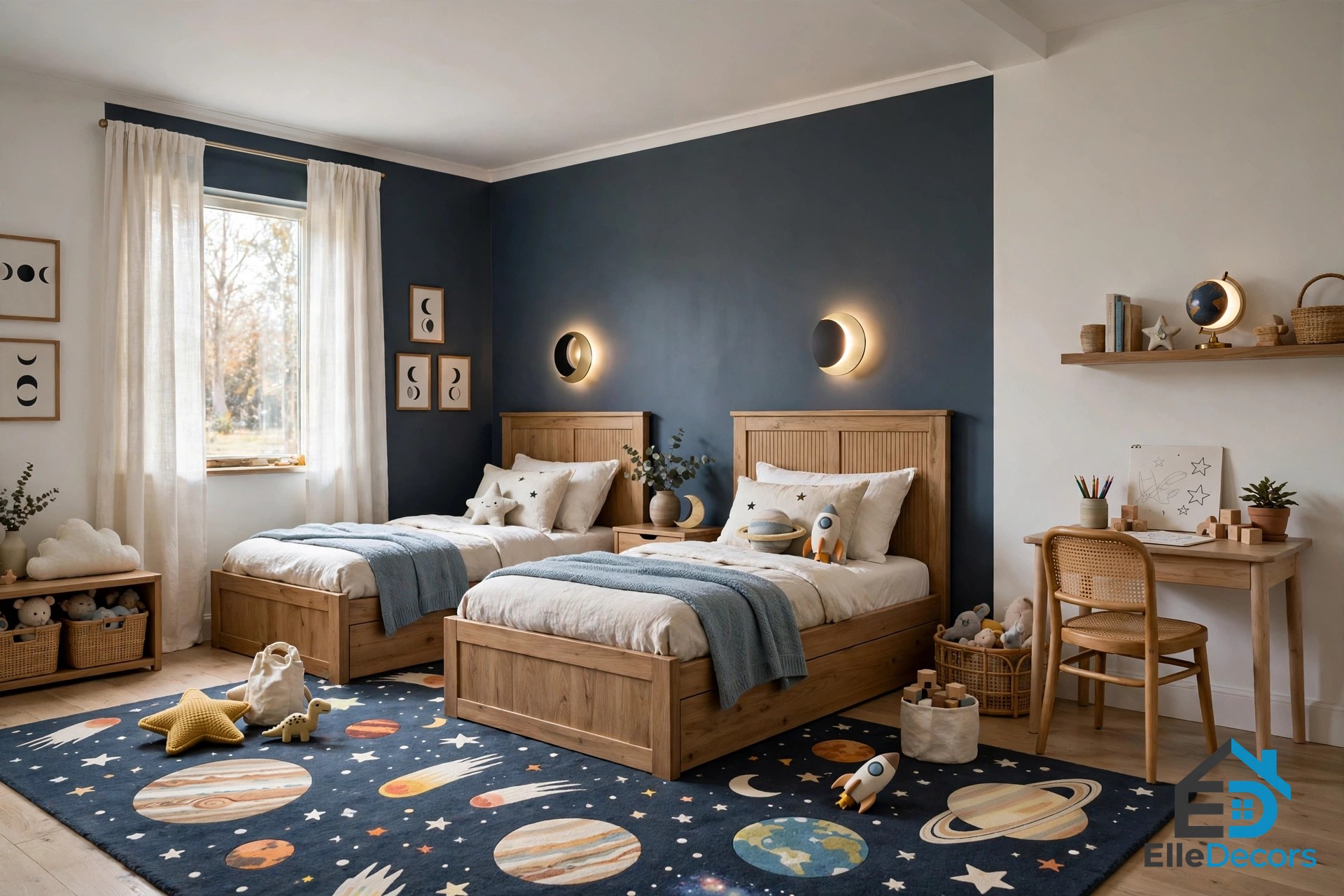
The dark blue-grey theme makes an effective colour palette inside a kids’ room too, particularly when teamed with space themed decor. In the second home, bespoke kids’ beds are illuminated under eclipse wall lamps and surrounded by storage cabinets, a space themed rug fills the floor, comfy ottomans sit by the TV, and a custom-made double workspace stands ready for homework, with stylish desk chairs and brass drawer handles creating a high-end look. The dark palette hides marks better than pale walls, and the space theme gives the blue a story children understand. Keep the ceiling and one wall white for homework light, and let the blue live in the beds, the rug and the storage.
What Pairs Best With Gray and Dark Blue
Gray and dark blue pair best with warm materials and pale neutrals. White is the first partner: white walls, white ceilings and white scatter cushions lift the whole scheme and stop the dark tones closing the room in. Warm wood is the second: light oak floors and feature walls, walnut cabinet fronts and walnut panelling all warm the blue up. Brass is the third: brass hardware on blue-grey kitchen units, brass suspension lights and brass table frames catch the light and add glamour. White marble backsplashes and tiles bring luxe brightness to kitchens and bathrooms. Avoid cool chrome everywhere, which doubles the cold feeling, and too many blues at full strength, which blur into one muddy note; vary the depth instead, from ink to navy, dusty blue and a touch of teal.
Mistakes That Make Grey and Blue Look Heavy
Three mistakes turn this pairing from sophisticated to oppressive. First, painting every wall dark blue and furnishing the room in dark grey with no pale relief — the room needs white ceilings, pale walls somewhere, or a light rug to breathe. Second, using flat paint on every surface with no texture: without ribs, panelling, velvet or wood grain, two flat dark colours look like a painted box. Third, lighting the room with a single cool ceiling light. Gray and dark blue absorb light, so one cold source leaves corners in shadow; layer warm spots, strips and lamps instead, and check the room at night before you commit to the palette. The second Moscow home avoids all three with white walls, panel moulding, oak and brass — borrow that formula.
Quick Comparison: All 12 Ideas
This table sums up the twelve ideas in this guide, with the room each suits best and how big a commitment it is.
| Idea | Best room | Commitment |
|---|---|---|
| Grey carries the room | Living room, any room | Low |
| Ribbed texture panels | Living room | Medium |
| Ink blue cushions | Living room | Low |
| One blue accent chair | Living room, bedroom | Low |
| Blue bookcase, walnut breaks | Living room, study | High |
| Layered lighting | Living room, kitchen | Medium |
| Teal in the kitchen-diner | Kitchen, dining area | Medium |
| Black, white and grey frame | Kitchen, dining area | Medium |
| Brass and oak warmth | Living room, kitchen | Low |
| Blue-grey bedroom | Bedroom | Medium |
| Calm grey bathroom | Bathroom | Low |
| Space theme kids’ room | Kids’ room | Medium |
Watch: Gray and Blue Living Room Design
Watch this tour of 27 grey and blue living room decoration ideas, showing how the mix of blue and grey gives a cool yet elegant feel in finished rooms. It walks through real rooms using the two colours in different proportions, so you can see which balance suits your space before you paint. Gray and dark blue look different in every light, and seeing the pairing in finished rooms is the fastest way to judge how much blue your room can carry.
Video: “Gray and Blue Living Room Design – Design Ideas” — a tour of 27 grey and blue living room ideas.
Frequently Asked Questions
Does this palette work in small rooms?
Yes, if grey leads and blue accents. Gray and dark blue can work in a small room as long as grey leads and blue stays in accents: paint the walls pale grey, keep the ceiling white, and bring the blue in through cushions, one chair or a rug rather than whole walls. A round rug in the two tones helps zone the seating area without adding bulk, and a mirror or glass surface bounces light back into the room. Avoid dark blue on all four walls — one feature wall is the limit.
What colours go best with grey and blue?
White, warm wood, brass, walnut and marble. White lifts the scheme, oak and walnut warm it, brass adds glamour and white marble brightens kitchens and bathrooms, while teal works as a softer blue in open-plan spaces. Avoid cool chrome in large amounts and avoid piling on too many blues at full strength in one room.
Can I use dark blue in a rental?
Yes, and textiles are the renter-friendly route: ink blue cushions, throws, curtains and a blue accent chair all move with you. A blue rug zones the room without touching the walls, and a blue-painted piece of second-hand furniture is cheaper than repainting a room you do not own.
Which room should I try first?
Start with the living room, because it is where you spend the most time and where the palette is easiest to test. One grey sofa, a few ink blue cushions and a brass lamp tell you within a week whether you love living with the colours. Our guide to a dark bedroom ideas scheme shows the next step once the living room works — the bedroom, where the dark tones feel cocooning at night.
How do I stop the room feeling cold?
Add warm materials and warm light: oak flooring or a feature wall, walnut furniture, brass lighting and handles, and warm bulbs all counter the cool tones, while a wool rug and linen or velvet textiles soften the hard surfaces. If the room still feels cold, swap one cool element for a warm one and the balance shifts.
Conclusion
Two deep colours can make a room feel suave or sombre, and the difference is never the colours themselves — it is the balance. Let grey carry the room, break blue with texture, light it warmly and warm it with brass and oak, and the pairing rewards you with a home that feels sophisticated in daylight and cocooning at night. Start small, with cushions or a chair, live with the colours for a week, then go further with a panelled wall or a blue bookcase. Gray and dark blue is a palette that lasts because it is calm, classic and endlessly adaptable — the two Moscow homes prove it, and your home can prove it next.